.

How visual is your website builder?

Nov 24, 2017

“Visual” is an inflated term in the field of website builders. So much so, it doesn’t actually mean anything anymore.

We know that Sparkle is distinctly more visual than any competitor, so let’s try to break down what visual means, and what the “degrees of visualness” are.

It’s useful to view this on a scale, so here I offer a scale of visualness of website builders.

How many stars does your website builder have?

Why not code?

It’s a legitimate question. With so many advocates of code, claims of simplicity, why would you not code?

HTML and CSS are extremely powerful, but also extremely complex, and perhaps more importantly, defyingly unpredictable.

When you’re creating an HTML/CSS layout every property interacts with every other, resulting in slow and excruciating process, riddled with compromise, of converging on something that works.

This complexity becomes an approachability problem, it is really hard for a beginner to get into coding when seemingly nothing works. There’s no stronger testament to the approachability problem than the flood of “visual” website building tools.

Case in point, making an image work in this multi-device, multi-screen-resolution, multi-compression world, or “responsive images”, is so complex even coders advise against writing it by hand:

Automation is your friend; if your page is going to include massive code blocks referencing numerous alternate versions of an image, you’d do well to avoid authoring everything by hand.

Not to mention the CSS shapes feature used in image wrapping, that we are introducing in Sparkle 2.5. It’s so complex that no other tools implements it fully, and it’s very rarely seen on live sites around the world because it’s so complex to code.

In short, coding is a full time job, and even then you heavily rely on tools to help.

Why not develop a tool for both code and visual design?

Unfortunately it’s simply not realistic for a web design tool to be at the same time fully visual, fully bidirectional, and give fine grained, opinionated control over the generated HTML/CSS.

What do these even mean?

By “full visual” I mean a tool that gives you a user interface that doesn’t require you to know the difference between inline and inline-block, or content-box and border-box. Why is this a requirement? Because once you abstract away from low level details the tool can present the user with a much more powerful user interface, as per Archimedes’ “Give me a lever long enough and a fulcrum on which to place it, and I shall move the world”.

This isn’t just about not learning a couple things about HTML (which is simplistic to the point of being damning). The parallel of a fully visual tool in other contexts is for example Adobe Illustrator, which does to Postscript what a fully visual tool would to to HTML. This is what the latest Illustrator can do, imagine doing the same by manually editing the individual Postscript curves.

Without the abstractions the tool isn’t a tool, it’s shallow spray-on usability, it’s like using a computer as a typewriter to print on paper, or the internet as a glorified fax machine, a toothless cog. To paraphrase a smart guy, “if you see a selector, they blew it”.

By “fully bidirectional” I mean a tool that lets you edit indifferently visually or in code, and translates back and forth. You want fully visual editing for the abstractions mentioned above, and you want code editing perhaps to integrate the code with a backend, or to use a specific CSS framework.

The tool would have both editing modes, and at some point would need to understand what the code means, to provide a high level user interface for that.

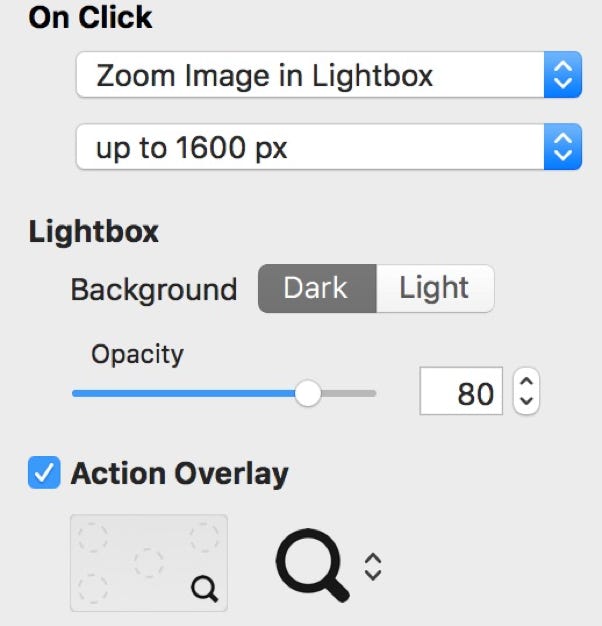
Take a relatively simple element such as an image that, when clicked, opens in a lightbox. For example in Sparkle it looks like this.

If you’re coding this, you can approach it in many different ways, and the tool would need to map the different options that you can tweak, for al the different lightbox techniques or intents, into what the visual side of things can do.

Clearly you have an enormously wider gamut of options when editing code, if you want bidirectional editing you either build an unwieldy user interface or you give up and offer the broken cog, a UI that maps directly to HTML and CSS concepts.

If you are unfamiliar with HTML/CSS/JS you might not know that they are like building blocks, with no high level semantics, no intrinsic meaning, like Lego bricks you can build an awesome Saturn V rocket or a castle, but nothing in the individual block helps in figuring out what the overall structure means.

The final nail in the coffin is that the lightbox, like most interesting structures in a web page, is most likely to use javascript, and analyzing code to understand what it does is in the realm of undecidable problems. In other words, for the visual side of the tool there is no way to really know what the javascript does, let alone build a UI for it.

Finally the opinionated control over generated HTML/CSS is the bane of visual website builders that cater to developers. Say this hypothetical tool adopts the popular Bootstrap framework, and has built support, UI, graphical assets for the bootstrap component and plugin ecosystem, you can bet they’ll have requests from people who want Foundation instead. Or perhaps Bootstrap falls in disgrace in 3 years and the tool needs to support an entirely different paradigm, side by side with the old one (to import existing project files). Or maybe 100 other nitpicky details about specific coding issues.

Web coders are inevitably stuck with simple tools (compared to other industries), because of a combination of a really complex language mix, a really narrow combination of techniques and practice to create a high performance site and a wide availability of cheap/free tools and a “thou shalt code” mantra. IE6 and Dreamweaver catalyzed this, and now they’re stuck in 2006 forever.

So code and visual tools remain distinctly separate. On one hand tools optimized for hand coding. Smart editors or tools that visually create a basic structure. On the other are fully visual environments, that generate code but don’t reverse it back into the visual interface. Both have merits and reasons to exist, but can’t be combined.

So what’s left?

The conclusion is you either go deep down the coding rathole, or pick a really good visual website builder.

Sparkle is the only ★★★★★ website builder out there, seems like an easy decision. Try it out!

★☆☆☆☆

★★☆☆☆

★★★☆☆

★★★★☆

★★★★★

you write code by hand

you write code, the editor helps with common tasks (layout, colors, borders, shadows, etc)

you build a page layout visually, but all settings are presented as CSS proprieties and code specific concepts

you build a page layout visually, but editing is limited to pre-built blocks or templates, you need code to complete the design and sometimes there’s no return to visual editing

you build the entire site visually, with full freedom, all the way through publishing, elements and proprieties are manipulated visually, no code or jargon

Copyright © Crinon SRL 

This website makes use of cookies.

Please see our privacy policy for details.

It’s Okay

Deny