Buttons are an essential ingredient in getting people to interact with your web pages. They can be one-off ‘Calls-to-Action’, or they can be grouped to form the basis of a complete site navigation. At the simplest level, you create a button by adding the ‘button’ element to the canvas. From there you can style the button using all the options found in Sparkle’s style panel.
The first thing you will need to do is to give your button a label so users know what it is. You also need to tell Sparkle what you would like the button to do when it’s clicked. This is called the ‘On-Click’ action.
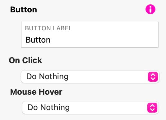
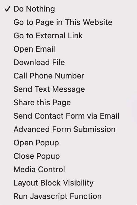
Here is a summary of the options:
Once you’ve given your button a label and an action, all that’s left is to style it using all of Sparkles familiar styling options. You can set colours, fills, outlines, rounding, fonts and have different styling option for each button state.
Thinking Outside the Box
When it comes to buttons, Sparkle gives you all the options you could ever want. You’re not stuck with the same old designs that everyone uses. With Sparkle, you can get really creative. Here we illustrate a few examples of Interactive buttons and how they were created.
PRESS
These are image buttons created by adding images to the button background. You can have image variations for each button state - Normal, Hover and Clicked.
Come Fly With Us
Click the Bird to Book
This element is a composite of a standard box outlined in red, two text boxes, and an image button in the centre. Simply group the elements to make one easy-to-place element
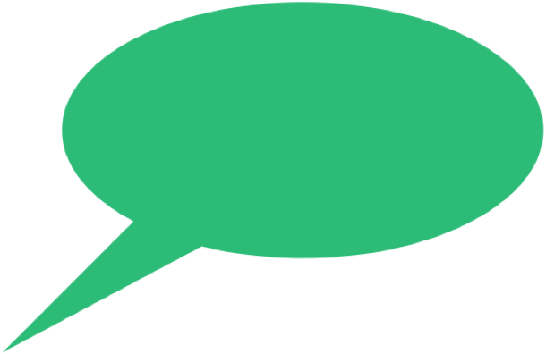
Here is another composite interactive element. In this first example, the speech bubble was copied from Apple Pages. The button was placed over the top and given a transparent background. The link would be set to Call Phone Number. The Click/Tap to call function only works on smartphones. It could also be used to have the user send you a text.

If you’re viewing on a Computer
Phone +34 000 111 111 2222
Click Here
to
Call me NOW
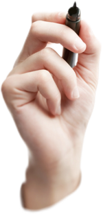
In this final example, you can create a link that opens an email client, or change the button label and have the link send a text message, or maybe open a form. Whatever you choose, the element is created the same way. The text is a button with a transparent background. It’s been grouped with the hand image to make it easier to move around on your page as a complete element.
Please report any shortcoming in this documentation and we’ll fix it as soon as possible!
Updated for Sparkle 5.5
This website makes use of cookies.
Please see our privacy policy for details.
It’s Okay
Deny