Sparkle’s image gallery is more than just an image slider - its potential uses go well beyond displaying a gallery of images. It’s one of Sparkles newest features and represents a big leap forward in the way information can be presented in a Sparkle page. The image gallery element now supports both images and PDF’s. One of the questions often asked by users is how to embed a PDF document in a Sparkle web page. Traditionally, the answer was to do what every other web design application does - add some code to the page that will allow the PDF to be displayed in an iframe. Clearly, this isn’t what the developers had in mind when they came up with Sparkle as a code-free web design tool. Well, all that is a thing of the past. The new gallery element takes care of embedding PDF documents into your web page with ease and simplicity, and it adds some refinements to make viewing images or PDF pages a pleasure for users.
When the gallery element is first added to a page, it looks like this. It’s a fairly standard looking slider waiting for you to add content.

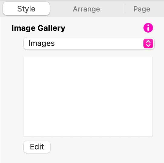
When used as a traditional image gallery, you would add jpg or png images through the ‘Image Gallery’ Section of the style panel. It looks like this.
Clicking the Edit button will reveal an image selection panel where you can add your content. Just click the Add button to browse for images on your disk.
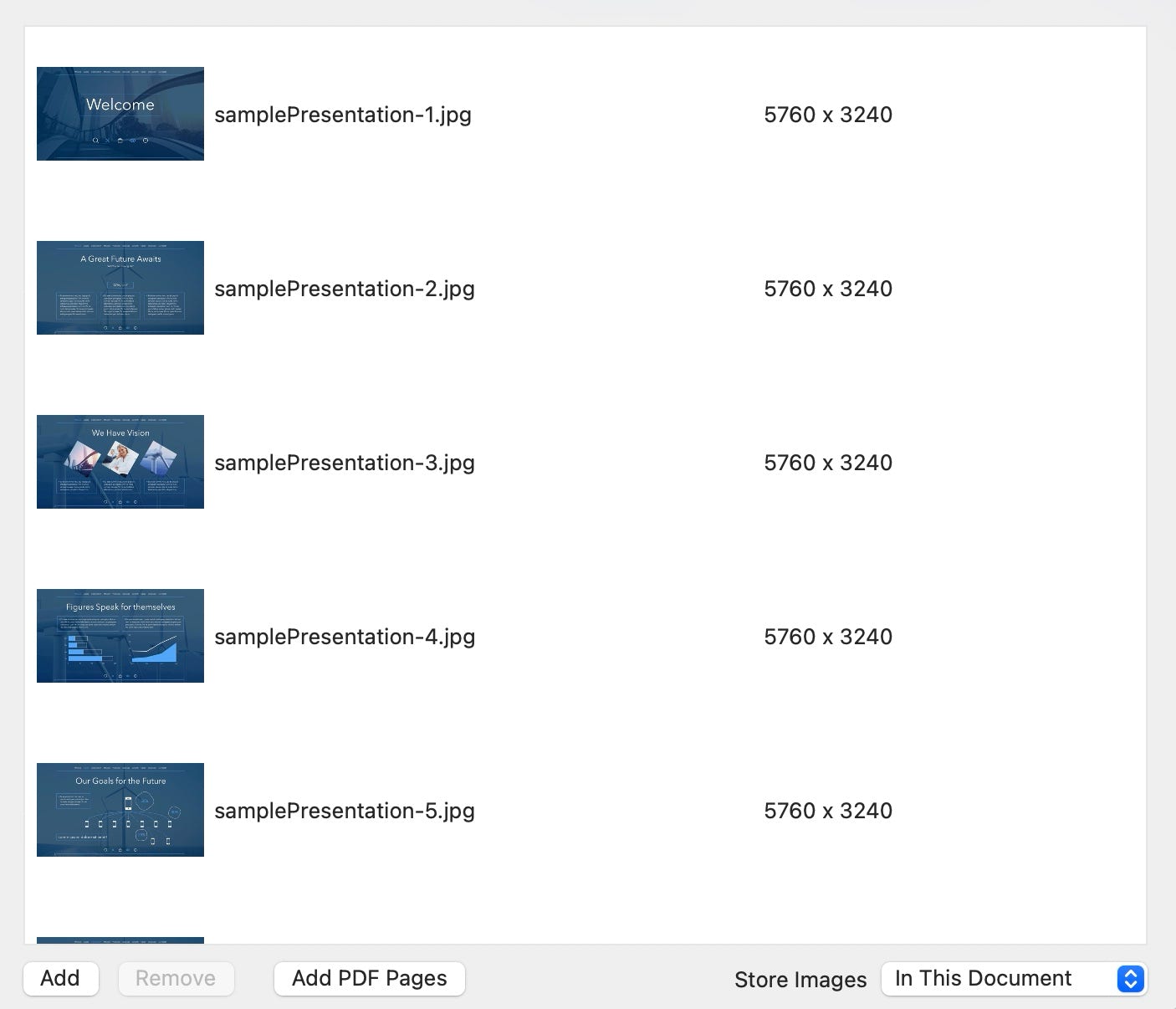
You can also Add PDF pages. These can be either single or multipage PDF files. When you add PDF’s, Sparkle converts each page into a high quality image that gets embedded into the gallery. This makes it easy to embed presentations or brochures into your web page and makes your documents completely font-independent. When combined with the gallery lightbox function, pages will be zoomed up on screen to make for easy reading. In the example below, a Keynote presentation was exported as a PDF file and added to the Image gallery. Click on the gallery to see the simplicity of displaying presentation material in a web page.
There are many creative ways you can use the new image gallery element. For example, you could create a simple two image gallery and have it automatically play the slideshow to create an eye-catching call to action on your page. Here is an example.
In this example, you could set different on click actions on each image - one to open a sign-up form in a popup, the other to open a different popup that explains the offer in more detail. Try it on this example. - wait for the images to change, then click on them.
You don’t have to be a graphic artist to create simple banners like this. You could just use the Apple tools you have available. This example was made as a two page keynote presentation (custom sized) and then each slide was exported as an image. You could also export the two slides as a single PDF file and use that to populate the image gallery.
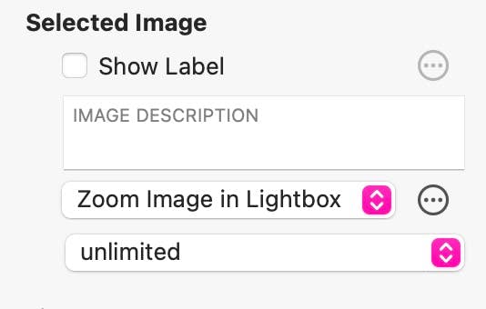
So, having seen what the new image gallery can do, let’s take a look at how you set it up and style it. Like almost all elements in Sparkle, everything gets set up in the Style panel. We’ve seen above how simple it is to add content, so let’s move on to styling and options. The second section of the style panel lets you set an on-click action for each individual image. This is a very flexible option that allows you to add different actions to different images. Any action currently supported in Sparkle can be set. The most common action for a gallery would probably be the ‘Zoom Image in Lightbox’ option. This will display the images at a larger scale over a dimmed background to give users a bigger picture. If you wanted to apply the same on-click action to all the other images, click on the settings icon (three dots in a circle) This will present the option of applying the action to all images. If the ’Show Label’ option is checked, your slide will be overlaid with a text label. This can be styled and moved as desired - even below the slide if required.
When the lightbox option is chosen as an on-click action, the style panel will present you with a number of additional options. These are shown below and are largely self explanatory.
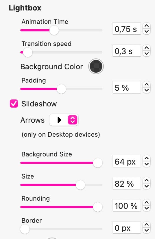
Deselecting the Slide show checkbox will remove the left and right arrows, both on the canvas, and when the slideshow opens in a lightbox. However, once the lightbox is open, the slides can still be advanced using swipe actions. This may be a useful option if you want to force users into opening the gallery in a lightbox before being able to scroll through the images. Effectively, the first image will remain static on the page. Of course, you will have to add an action overlay on the image to let people know that it can be enlarged.
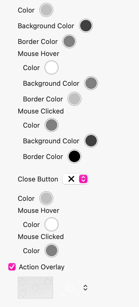
The next set of options allow you to style the various elements of the slideshow navigation buttons, including the standard color of the arrows, as well as the mouse hover and mouse clicked colors.
The close button is the icon displayed in the top right of the slideshow that allows users to exit the slideshow and return to the page. You have a choice of styles , each of which can have different colors applied based on the button state.
The action overlay is where you select an icon to overlay onto your gallery images to let people know that the images are zoomable. This overlay can be set on a slide-by-slide basis and includes both black and white versions, depending on the background color of your images. If all your images have a similar background, as in our keynote presentation above, you can apply an action overlay to the first slide only, and then set ‘apply action to all images’ next to the ‘zoom image in Lightbox’ option.
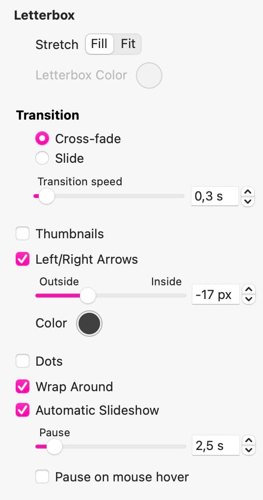
The final options give you control over how your gallery will be displayed. The letterbox option is designed to allow for the inclusion of images of different aspect ratios. If your images are set to ‘FIT’ their size will be adjust to fit within the gallery boundary. This may result in a letterbox effect, either to the left and right of tall images, or above and below wide images. You can use this option to set a background colour for that blank space around your images. If this option is set to ‘FILL’, your images will be zoomed to fill the gallery box. This may cause clipping of some images.
The Transition option allows you to set the speed of the transitions you apply to your slideshow. The options also allow for Cross fading of images, or a Slide effect. Note, that the cross-fade option will only work in the canvas version of the gallery - the lightbox version will always have a slide transition.
Selecting the Thumbnails check box will offer you additional options to display a grid of thumbnails under or above your gallery. This would allow users to click on thumbnails to navigate your gallery. As an alternative, you could choose to have dots instead.
The Automatic Slideshow feature will automatically advance your slideshow without any user interaction. Slides can be paused for a specific period of time before advancing to the next. You can also have the slideshow pause on mouse over.
Please report any shortcoming in this documentation and we’ll fix it as soon as possible!
Updated for Sparkle 5.5
This website makes use of cookies.
Please see our privacy policy for details.
It’s Okay
Deny