Text is one of the principal elements in web page layout. Not only does text tell your story, it also helps in creating a visual and search-engine hierarchy on your pages. In Sparkle, creating text is simple and straightforward. You just add a text frame to your page and start typing as you would in a familiar word-processing application. You can style your text in any way you wish, all from the comfort of the Sparkle style panel. When you first add a text frame (or Text Box as it’s known in Sparkle). you will see a default frame on the page that looks like this:
The frame itself is actually placed at the optimal size for text content on a page. On a 12 column page grid, the default text frame will span 6 columns. Whilst you can adjust the width and height of the text frame to any size you wish, body or paragraph text is best delivered in spans of between 6 - 8 columns in order to make them easy to read.
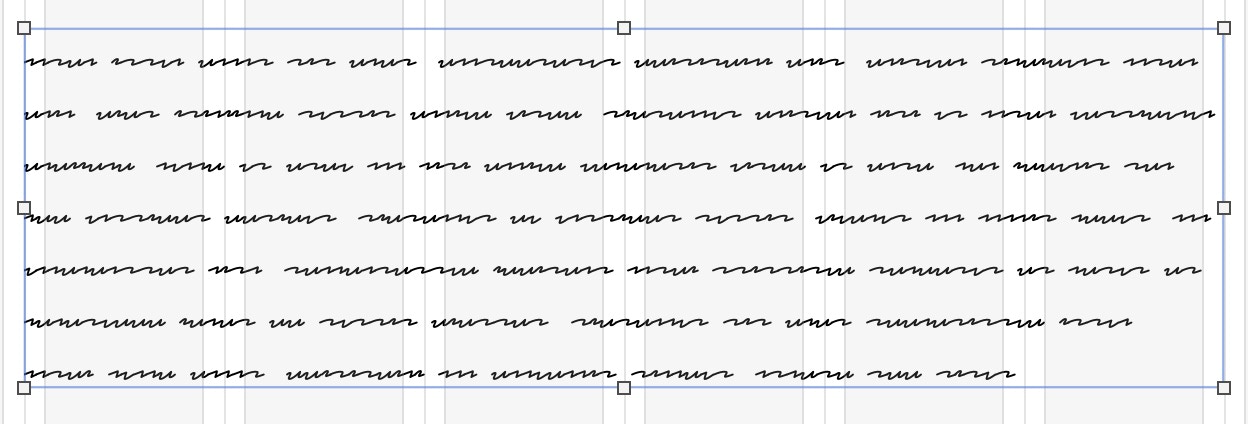
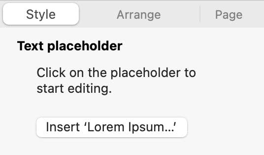
When the text frame is first placed on the canvas it contains simulated text, which is great while you are first laying out your page design. To replace the text, just click inside the frame and start typing. The simulated text will disappear and be replaced by your content. If you don’t have your text content ready, you can choose to fill the text frame with actual placeholder text that you can style to better represent how you want your text to look on the page. You do this by selecting the frame and clicking on the ‘Insert Lorem Ipsum…’ button in the style panel.
In publishing and graphic design, Lorem ipsum is a placeholder text commonly used to demonstrate the visual form of a document or a typeface without relying on meaningful content.
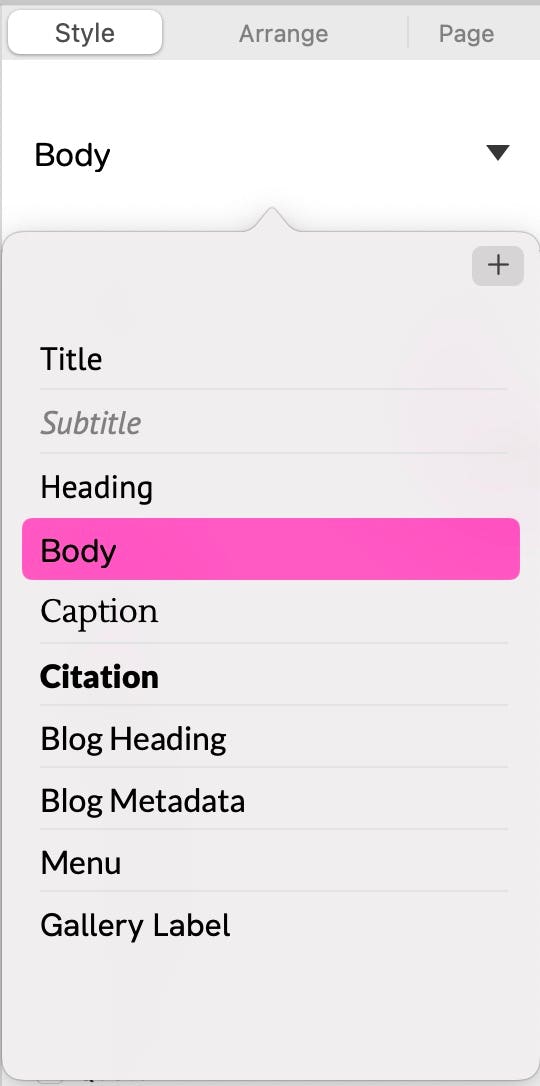
All text content, when its first added to a page in Sparkle, will be styled as ‘Body’ Text by default. This is the most common style of text used in web pages, so it makes perfect sense to use it as a default. Sparkle comes with a range of pre-made styles which can be seen under the styles section of the style panel. Text styles are actually a form of ‘productivity’ tool that helps maintain consistency, and is a common feature of most text editing applications, such as word processing software. Sparkle has adopted this familiar method for styling text so you can concentrate on laying out your content in a visual way, rather than having to rely on CSS code to create the desired look of your text. In fact, styles are so important, it’s worth spending a little time exploring them in more detail.
The Importance of Styles
Styles are a little like invisible post-it-notes that can only be read by web browsers. When a browser sees one of these notes, it knows that the text must be displayed in a particular font, at a particular size and in a specific color. The notes also contains other information, such as the text alignment, the line height, spacing attributes and just as importantly, how search engines should treat that text content. This is quite a lot of information to have to apply to many different text boxes in a website. Therefore, using ’styles’ is a really efficient way to provide this detail in a consistent manner across all your web pages. Furthermore, if you decide to change some aspect of a particular style - maybe its color or font, you can simply change the style and it will be applied across your whole website wherever that style has been used.
Changing a Style
Making changes to a style couldn’t be simpler. Just select a piece of text styled with your existing style, change the formatting of that text in the style panel, and then update the style. For example, to change the style of your body text, select a text box styled as body text and make your changes on the canvas. Apply a different font, change the text size, color or any other attributes. When you make these changes you will see that an asterisk appear next to the style name in the style panel.
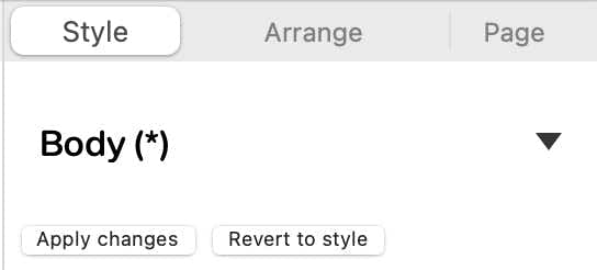
This is Sparkle’s way of letting you know that you’ve made some changes to the style, and gives you the option of updating your style by clicking the ‘Apply changes’ button, or discarding your changes and going back to the original style by clicking the ‘Revert to style’ button. Applying the changes will instantly change all the body text elements in your pages to reflect the changes to your new style. If you ignore this option, your changes will ONLY apply to the text you were working on - everything else in your site will be unchanged.
Creating a New Style
Sometimes, you may want to create a completely new style, rather than change an existing one. You can add a new style by clicking on the ‘+’ icon at the top of the style dropdown. this will create a new style at the bottom of the list that you can name in any way you like. By default, the new style will have all the attributes of your standard ‘body’ style. To set the new attributes, just create a text box and add some text. Apply your new style to the box. Next, using the style panel, make all the attribute changes you need for your new style. When you see the asterisk next to your new style name in the style panel, apply the changes. Your new style is now ready to go and can be applied anywhere in your website.

It’s important to note that styles are applied to whole text frames. So if you have a situation where you may have a mix of text attributes within a single text frame, for example, where you have a text box styled as body text and then selectively create bold sub headings in a larger font size within that same text box, any subsequent changes you make to the body style associated with that text frame will change your headings to the style of the whole frame. For this reason, its often better to keep headings and subheadings as separate text frames on your pages and allocate different styles to them.
A Look at the Styling Options
Having now acquired a better understanding of ‘Styles’, we can now move on to see all the various attributes that can be applied to text content. Many of them will already be familiar to you if you’ve ever used a word processing application, but here’s a quick refresher.
The fist section in the style panel is the Font section.
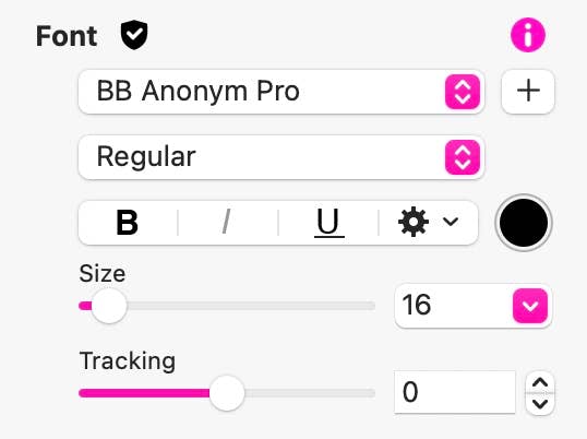
Here you can select a font from the drop-down list of fonts available on your system. You can also choose from a list of font attributes, such as normal, light or bold. The list of available attributes will vary depending upon the font you choose. Some of the more common attributes are also shown as Icons, such as Bold, Italic and Underline. Some of these options may be greyed out if your chosen font doesn’t support some attributes. Next, you can select a size for your text as well as introduce some tracking. This is the space between individual letters. Some fonts have a very tight tracking, sometimes making it difficult to read, particularly at smaller sizes. The tracking option allows to to add some additional space between the letters.
You may have also noticed that cogwheel icon next to the attribute icons. This is where you can set some advanced options such as capitalization, subscript and superscript, text background color or add a shadow effect to your text. Finally, you have a color well where you can select a color for your text. Clicking the color well will open Sparkle’s color panel so you can select a color from your website palette.
Next up is the Paragraph section.
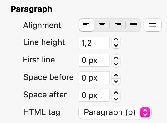
This is where you can choose attributes that are applied to whole paragraphs. The first options are text alignment. These allow you to align text to the left, centre, right or fully justified. The double arrow icon is primarily used when entering text in languages that reads from right to left instead of left to right. It can also be used as a simple toggle to switch from left aligned text to right aligned.
The next option is line height. This determines the space between lines of text. In web design this is best set at between 1,2 to 1,4. However, the final spacing will depend on the font and size of the text you’re creating. It’s often best to set line height visually so that it’s easy to read.
The ‘first line’ option allows you to set a first line indent to each paragraph. Whilst this is a common feature in book publishing to help segregate paragraphs of text, it can also be used, less commonly, in website pages. This may be particularly useful if you’re setting a large amount of text where additional paragraph segregation may be important. The ‘space before’ and ‘space after’ options are for setting the line spacing before a paragraph and after a paragraph. This is the more common way of segregating paragraphs in web pages, but ultimately, it’s all a matter of personal choice.
The final option is the HTML tag. This is a sort of identifier that search engines use to determine the importance of text content on your page. Whilst this often correlates with the visual hierarchy created by headings, sub headings and body text, it doesn’t have to be. In the world of websites, you can designate text as heading text (denoted by H1 through to H6), or it can be denoted by the letter ‘p’, which means paragraph text. In general terms, H1 is the most important element on the page in terms of search engines establishing what the page is about. Each heading level after that (H2 - H6) demotes in importance. Paragraph text is the main page content as far as search engines are concerned. This is the text they will most likely index to establish relevance of your web page to search queries. As a general rule you should only have one H1 tag on a page, whilst you can have as many of the others as you want.
Following on from the more general paragraph setting, we have some additional options in the form of check boxes. These are used to apply special formatting to paragraphs.
In the example below, the Knockout Effect has been applied. The knockout effect is essentially an option that allows a background colour to be blended with a foreground text colour to create different effects. This option is really intended for those from a graphics background that better understand ‘blend modes’. For most users, it would be just as simple to place text on top of a coloured box and style each element individually.
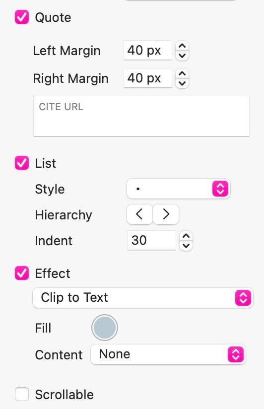
Quote
This option indents a paragraph on both the left and right. You can set the indent/margin with the options that appear when the quotes checkbox is selected.
List
Effect
This option creates special effects on the selected text, such as filling with an image, gradient or pattern. Here is an example of the Clip to Text option in which the text has been filed with an image.
SAMPLE TEXT
SAMPLE TEXT
Scrollable
This option turns your text frame into a scrollable box so it can hold more text that can be seen on the page. When viewed in a browser, users will be able to scroll up or down to reveal the text. This text frame is an example of this feature in action. Scroll this box to reveal the additional ‘Lorem Ipsum’ text below.
Lorem ipsum dolor sit amet, consectetur adipiscing elit. Aliquam tincidunt lorem enim, eget fringilla turpis congue vitae. Phasellus aliquam nisi ut lorem vestibulum eleifend. Nulla ut arcu non nisi congue venenatis vitae ut ante. Nam iaculis sem nec ultrices dapibus. Phasellus eu ultrices turpis. Vivamus non mollis lacus, non ullamcorper nisl. Pellentesque habitant morbi tristique senectus et netus et malesuada fames ac turpis egestas. Phasellus sit amet scelerisque ipsum. Morbi nulla dolor, adipiscing non convallis rhoncus, ornare sed risus.
Sed adipiscing eget nibh at convallis. Curabitur eu gravida mauris, sit amet dictum metus. Sed a elementum arcu. Proin consectetur eros vitae odio sagittis, vitae dignissim justo sollicitudin. Phasellus non varius lacus, aliquet feugiat mauris. Phasellus fringilla commodo sem vel pellentesque. Ut porttitor tincidunt risus a pharetra. Cras nec vestibulum massa. Mauris sagittis leo a libero convallis accumsan. Aenean ut mollis ipsum. Donec aliquam egestas convallis. Fusce dapibus, neque sed mattis consectetur, erat nibh vulputate sapien, ac accumsan arcu sem quis nibh. Etiam et mi sed mauris commodo tristique. Proin mollis elementum purus, a porta quam vehicula et.
The final options are Insert ‘Smart Field…’ and ‘Insert Icon…’ The smart field option will allow you to add a field that calculates from a formula, or displays information generated within the website. The many options are shown below, but we have a whole section within our documentation that explains these options in greater detail.
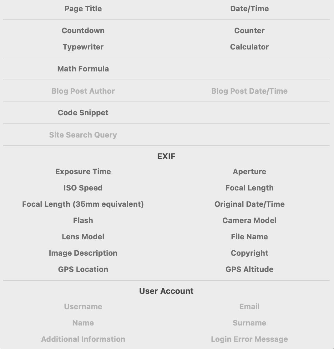
Here are some examples
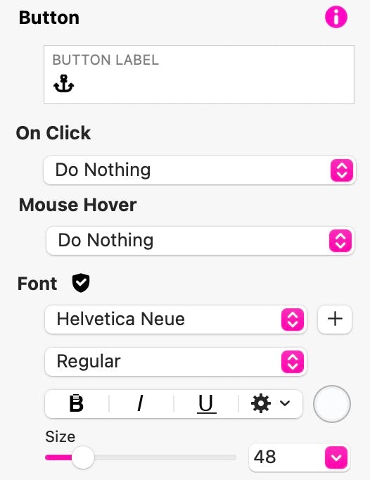
Handy Tip: If you want to create button-type icons, simply add a button to your canvas. Style it and size it however you wish. Then select the button label and use the Insert Icon option to add an Icon to the button. You can resize the icon by adjusting the button’s font size in the style inspector. This is an example of a button created this way, along with the settings for the button.
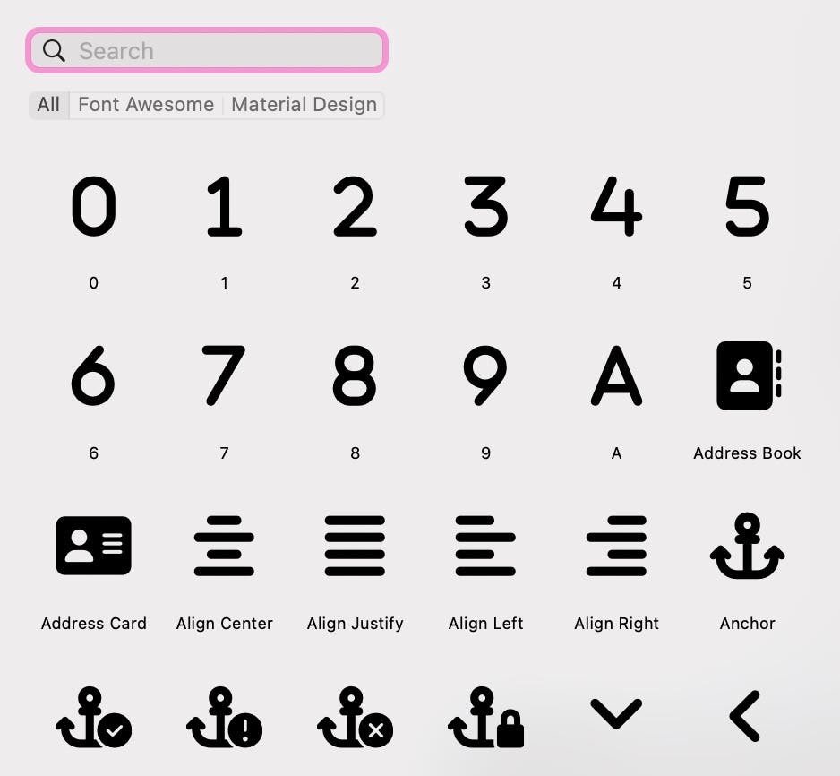
The ‘Insert Icon…’ option allows you to insert an icon into your text, Clicking this option will display a pop-up panel where you can select icons to include. Once placed in your text box, you can use other styling options to give them color and make them larger. This is how the panel looks - just click on an icon to add it into your text box.
Best Practice Tips
When embarking on a new website project, its best to set up your text styles at the outset. This can save you a lot of time as your start to work on your project. To help you set up your styles, we’ve created a template that makes it easy to change the default text style to ones of your preference. As a bonus, the same template can be used to set up a custom color palette for your projects. Please note, using the template does not change any of Sparkle’s default styles or colors - any changes you make using the template will only be applied to the document you are working on. Any new projects you start will have all the Sparkle defaults. Click the link below to download the template - full instructions are included in the template.
Quick Video Tutorials
Please report any shortcoming in this documentation and we’ll fix it as soon as possible!
Updated for Sparkle 5.5
This website makes use of cookies.
Please see our privacy policy for details.
It’s Okay
Deny