A hero image is essentially a large banner image, often used in conjunction with overlaying graphics, to act as an introductory experience and mood-setter for the site.
“Hero image” is a bit of an umbrella term for combinations of background pattern, image, video or animation with tints or blurring effects. While the visual set the mood and drive the eye, relevant information and actionable items are placed in the surrounding area. More than just an exercise in graphics, a hero is an excellent way to begin your website, exploring your creativity through it, with the ultimate goal of making an impactful and lasting impression.
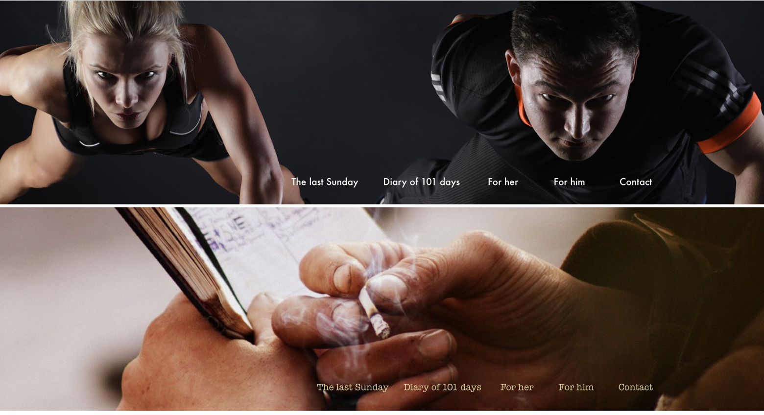
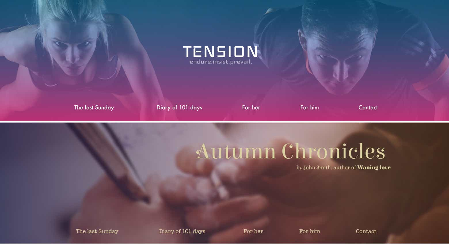
Image choice clearly depends on the context. For example a website about exercise and intense training would focus on body pose, movement and tension of the moment. A melancholic personal blog would focus on colors and details that build the mood, like a cigarette burning away, in the dirty and calloused hands of an absent minded loner.
The words used are the same to better illustrate the difference in the emotional stimulation of the viewer. Similarly to the image the font type and color contrast work towards the desired effect. From here on out the pictures would diverge even more.
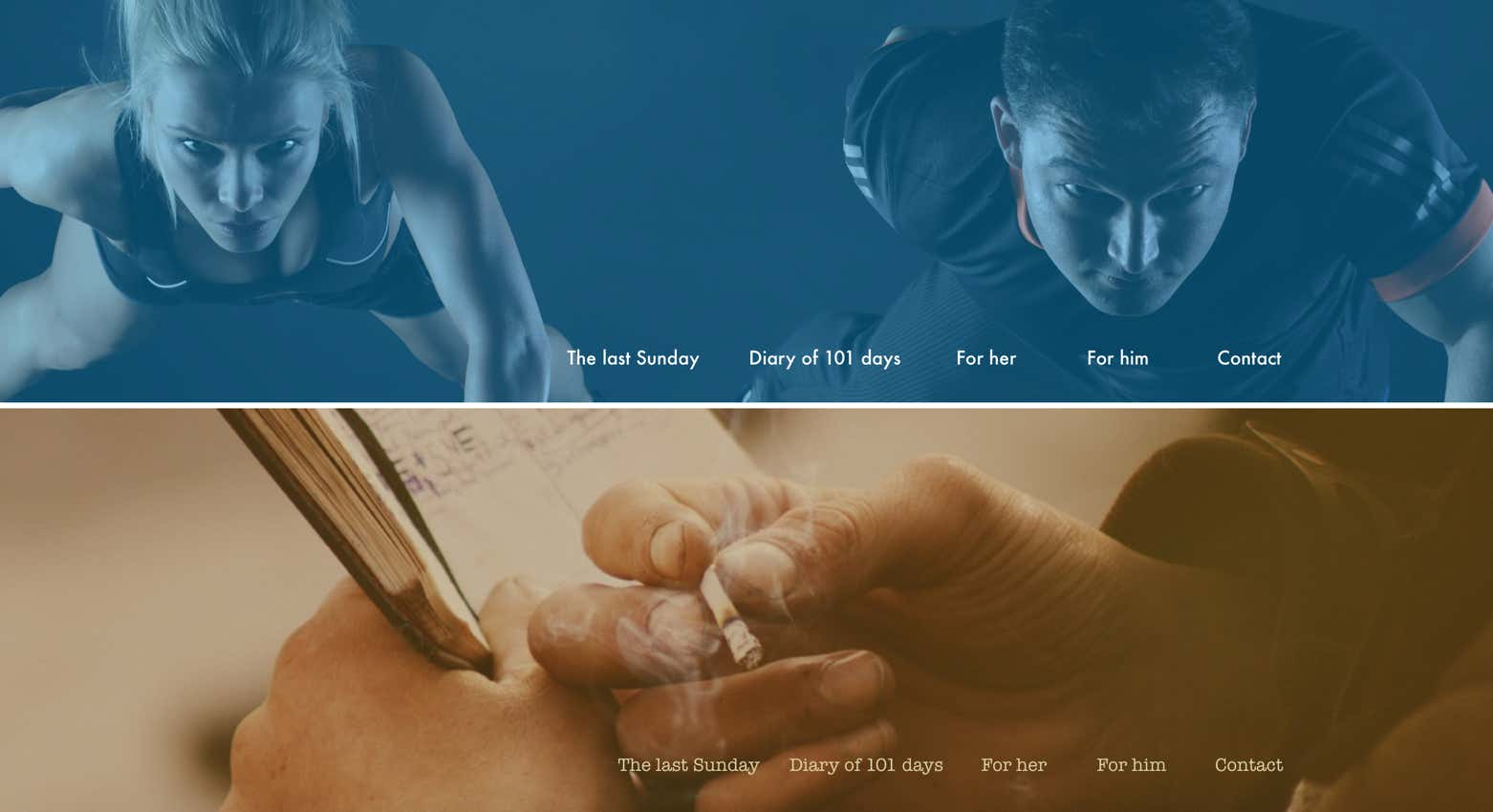
Let’s add some overlay effects. The most commonly used effect is a color tint over the image, but behind any text:
We can see right away that the images take on a supernatural quality. They are no longer talking about a realistic situation, but an idealization of their original concepts.
While interesting, there is however something wrong with the design. Since both images lost their realism as well as their visual clarity (mostly due to shadows and strong, moody colors), their being the center of the viewer attention causes a visual discomfort.
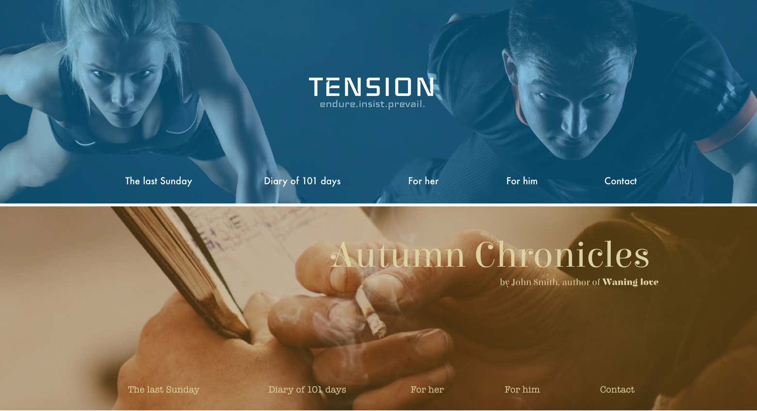
Although far from complete, the visual results are much improved. Our eyes are already drawn to the titles and header in a natural way. Of course there is no way we would have a hero image without at least a header, but it is important to realize how each component is a building block that gives birth to possibilities, and each tier introducing new elements resets the playing field.
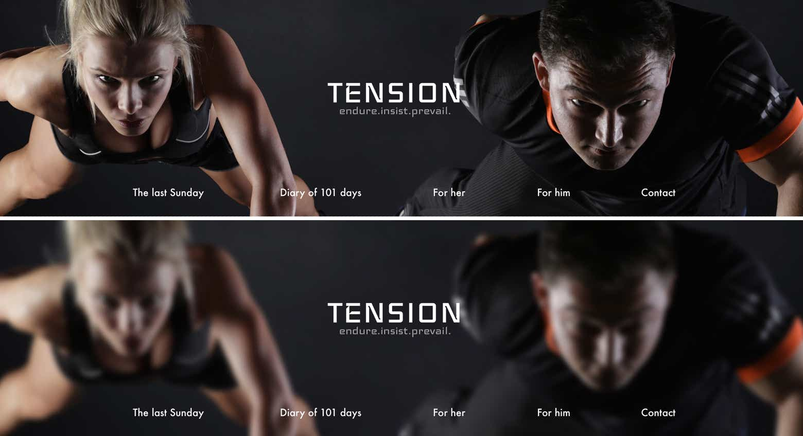
Another popular effect for hero images is blurring:
Here you can immediately notice a big problem. The models in the image are looking straight at the viewer, but because of the blurring this intense emotional effect now ranges from awkward to comedic, rendering the effect inappropriate for this image.
If we were to set aside this problem however, we can notice several advantages. The image already had most areas covered in very dark colors, making white bold letters an obvious choice. However some parts, like the word Diary over the woman’s elbow and the N from tension meeting the white stripes of the mans shirt, while not reducing the clarity of the text, felt awkward. All the text is centered on the frame, so moving it is not a welcome option. Thanks to the blurring this is no longer the case.
To end the chapter, remember that the hero image is the first impression of your page: it deserves a lot of your attention and time. Be spontaneous and experiment a lot to discover all kinds of creative ideas.
Here’s a quick test with a gradient overlay.
Please report any shortcoming in this documentation and we’ll fix it as soon as possible!
Updated for Sparkle 5.5
This website makes use of cookies.
Please see our privacy policy for details.
It’s Okay
Deny