This is a practical feature of Sparkle that you should use whenever possible. Not only do layout blocks bring organized structure to your pages, they also make it incredibly easy to rearrange content on your pages. So, what is a layout block?
If you look at the illustrations of a typical website wireframe below, you will notice that the page elements are divided up into visually distinct sections - each section conveying a particular idea, concept or message.
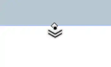
Hovering a mouse pointer over the resize handle will change the cursor to show that it is a resize handle, and that by dragging the handle, any layout blocks below the current layout block will move down the page as the block is resized.
Instead of having one long page with content arranged consistently from edge to edge. we have a more visually appealing structure, with some sections spanning three columns, others 2 columns, some one column and some 4 columns. This concept make a page less monotonous to view - it gives the human eye a rest as the page is scoured. It also allows your content to be more easily digested by the user, segregating its content into more easily assimilated chunks.
Each of these visual pieces of information make perfect layout blocks, and once they are created, they can be moved up or down the page to rearrange the content if required. Furthermore, moving a layout block will move all its content without disturbing its layout.
Creating Layout Blocks
Sparkle has a layout block element that looks like this:
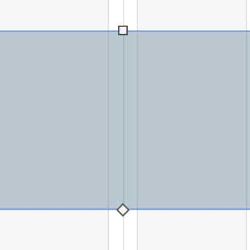
Clicking this element will place a layout block on the page, ready for you to resize and start adding content. When its first added to the page, it will resemble a wide box with a standard background. Its distinguishing feature will be a diamond-shaped bottom resize handle.

Although adding a block to the canvas and then populating it with content will work just fine, a more simpler approach may be to simply start designing your first content area - maybe a hero section for your web page. Once the content is designed to your liking, you can select all the elements making up your hero section, right-click and choose ‘Move to Layout Block’ from the context menu.
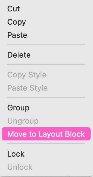
This action will group everything together and place the content inside a layout block for you. You can now move your layout block anywhere on your page, safe in the knowledge that your carefully designed hero section will remain intact and go along for the ride. This allows you to start designing the content for your next block. In many respects, layout blocks share all the styling features of wide boxes. You can set a fill color, give the block an image or gradient fill, apply borders (top and bottom), add shadow and background filters. You can also set your layout block to be a scroll location which makes it very easy to have your navigation link to specific parts of your page.
Other types of Layout Blocks
Sparkle has a couple of other layout blocks in its toolbox. These are essentially layout blocks that have been created for specific use-case situations. For example, the ‘Image/Video Grid’ and the ‘Layout Grid’ are both layout blocks which are designed for specific purposes. They work in much the same way as the standard layout block, but the content you add to them is more specific. Check the documentation for details on how these grids are used.
VisibilityOptions
Any layout block can be set to be initially hidden, which means it will not be seen when a page first loads into a browser window. In order for a user to see the layout block, you would have to provide users with some form of interactive element on the page that will reveal the block when clicked. A prime example of how this feature can be used is when you may wish to incorporate a mega-menu into your site. These are commonly seen in e-commerce websites where users will be given quick access to product groups through a main navigation link. Here is an example.
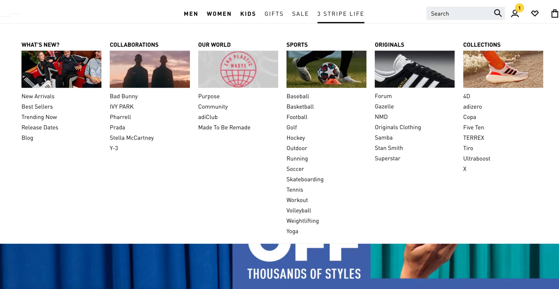
In this example, a user clicking a main navigation link will see a block of product categories and links that will take them to specific pages in the website. Clearly, it will be better for users if this mega-menu isn’t visible on first page load because it would tend to disrupt the flow of the main page design. So, by creating the mega-menu in a layout block and initially hiding it, the page remains clear and uncluttered. However, clicking a link, will reveal the menu and all its choices. You will see the option to hide a layout block in the style panel when you have a layout block selected on the canvas.
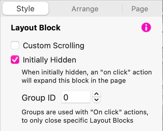
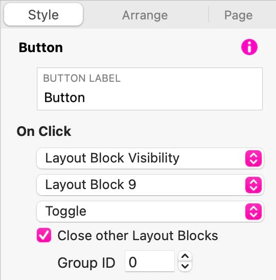
When using this feature, its a good idea to allocate a Group ID to your layout blocks - this is just a number that denotes the layout block belongs to a specific group of blocks on the page. The default is zero, but you can use any number of your choice. The reason this is important is because when you create a link to reveal the block, whether that be a normal menu link or a button, you will have the option of closing any other layout blocks on the page when the link is clicked. Clearly, if I had two mega-menus linked to two different navigation links, I would only want one to appear at a time. Therefore, when creating my navigation links I would have the link close any other layout blocks before opening another one. By giving my mega-menu layout blocks a common ID, only blocks sharing that ID will be closed. In other words, only one mega menu will be displayed at a time. If I don’t include this ID number, clicking on a mega menu link may inadvertently close ALL layout blocks on my page. Therefore, I would ensure that all other layout blocks had a different Group ID.
Quick Video Tutorial
Please report any shortcoming in this documentation and we’ll fix it as soon as possible!
Updated for Sparkle 5.5
This website makes use of cookies.
Please see our privacy policy for details.
It’s Okay
Deny