This is a special layout block designed for easily adding video and image content to your page in a grid-like structure.
Start by adding the element to your sparkle canvas and adding the image or video content. You do this from the style panel while the Image/Video grid element is selected on the canvas. The option looks like this:
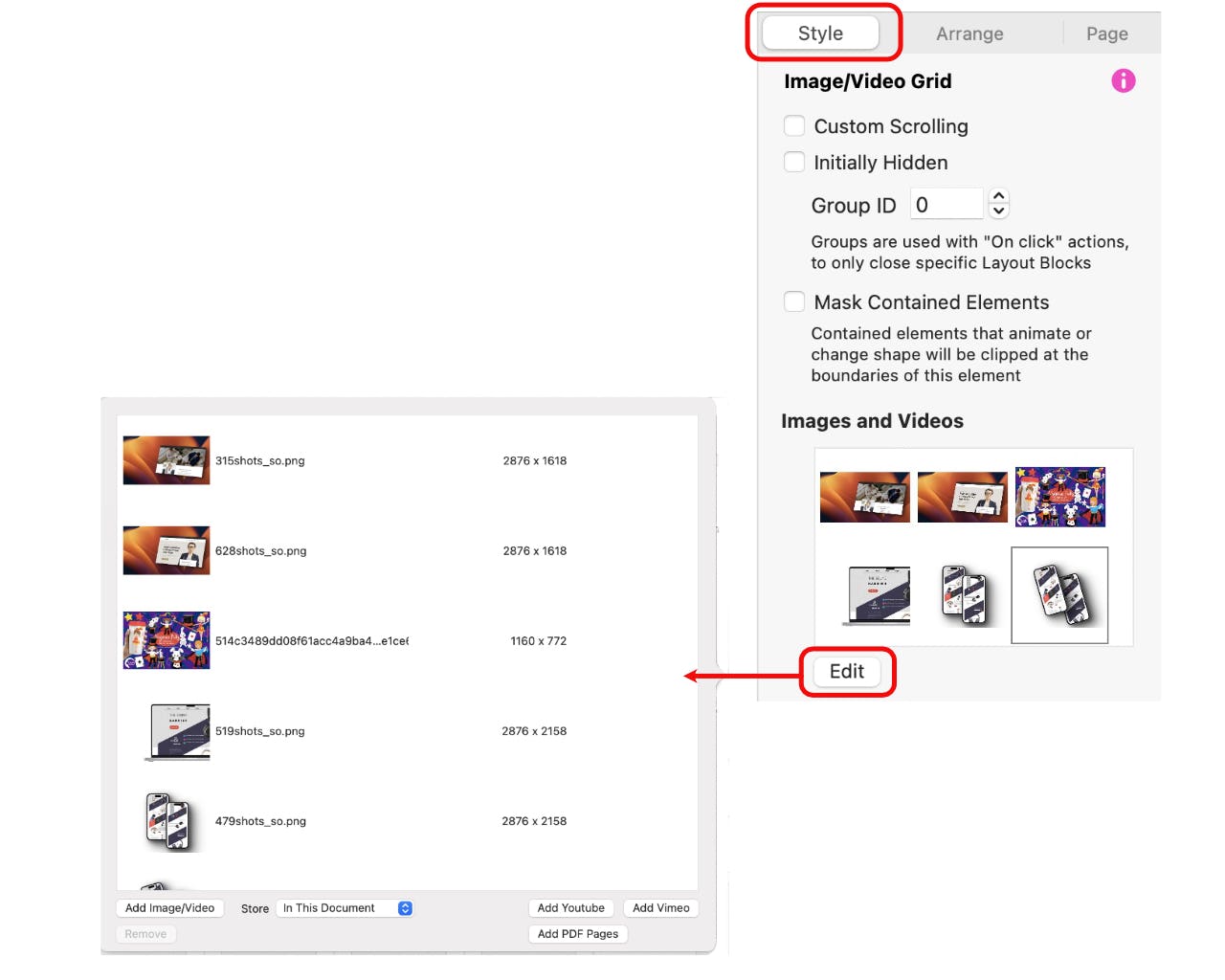
Although the grid, when first placed on the canvas, only shows a single row grid of three placeholders, it will grow to accommodate as much content as you add. For example, If you add six images, you will see the grid expand to three columns and two rows - if you add twelve images your grid will grow to three columns by four rows. To add content from your disk, click the Add Image/Videos button. To add YouTube or Vimeo hosted content, click on the appropriate buttons. You also have the option of adding PDF pages - more on that option in a moment. Having added some content, the grid will look something like this:

You can now adjust individual grid cells to create a more aesthetic look to your grid. Select each grid cell in turn, either directly on the canvas, or from the layers panel. Be sure to select the grid cell and not the image itself. The difference can be seen below. The white perimeter handles indicate that the image has been selected. The faint grey ‘X’s’ indicate the cell is selected.


With the cell selected, go over to the style panel and set the number of rows and/or columns you would like that cell to span. This is what the option looks like:
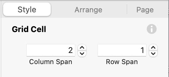
In the above example, the first cell has been set to span 2 columns and 1 row. Continue moving through each cell until your grid is styled to your liking. In our example grid below we’ve changed the grid and styled it with background colours and borders to look like this - we’ve shown the cell spans for each grid cell so you can better understand how it was created.

Creating a Slideshow
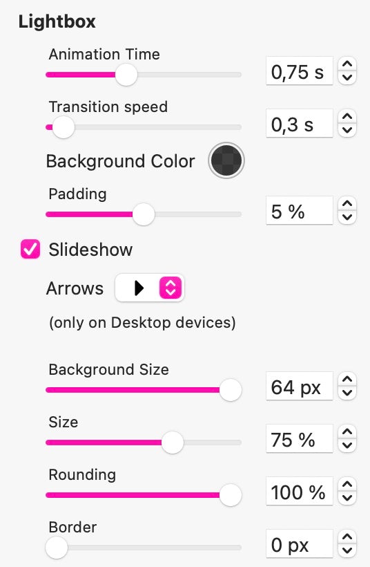
By default, clicking on any image within the grid will have it open in a lightbox. Typically, the image will zoom up over a dimmed background which can be closed by clicking anywhere on the background, or clicking a close button on the image (just like the images on this page). However, with the Image/Video Grid, you also have the option of creating a slideshow from your grid content. This essentially means clicking any content within the grid will open a lighbox as usual, but with the added facility of being able to scroll through all the grid content while the lightbox is open. This is how it looks on a webpage:

Notice those left and right scroll arrows? Those are added by setting the slideshow options over in the style panel. With the Image/Video Grid selected on the canvas, be sure to check the relevant options to make this feature work. The style panel will reveal many options for styling your grid, the cells and the lightbox, so be sure to check them all out.
Get Creative with PDF’s
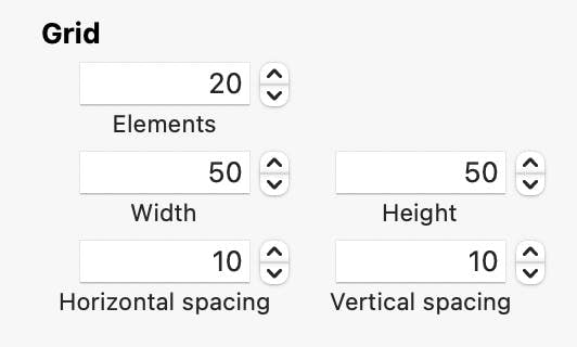
Thanks to Sparkle’s ability to import PDF documents into the Image/Video Layout block, you can now do things that were previously quite difficult to achieve. For example, you can import a multi-page brochure or a pdf copy of a Keynote presentation. Doing so will populate your grid with each page of your document (1 page per grid cell). Clearly, this may create a lot of grid cells that you don’t necessarily want your site visitors to see. Instead, you may want them to see the first page only, and then leave them to open the slideshow to see the other pages. This is easy to do in Sparkle. Below is an example of a 20 page presentation exported from Keynote as a multi-page PDF file. We only want users to see the opening slide, and only see the rest when they open the slideshow. To do this we change the grid sizes and layout. This is how our grid looks after applying a bit of styling.

The above was achieved by adjusting the cells to be 50px wide, 50px high and spaced vertically and horizontally at 10px. - all set in the style panel.
The first cell was selected and made to span 20 columns and 9 rows. This creates the illusion of a main image with a set of thumbnails underneath, as illustrated above. Whilst the thumbnails can remain in view, you may want to hide them so that only the main image is visible. People seeing the thumbnails may just assume that the main image will change when a thumbnail is clicked, which may not be the impression you want to give. To hide the thumbs, select each thumbnail cell in turn and set it to NOT show on this device in the ARRANGE panel. Now, when the main image is clicked, the slideshow starts, allowing users to move back and forth through the presentation. Try it on the live example below.


Click to Start the Presentation
The reason that we reduce the size of the thumbnails is to simply keep the layout block to a height that allows us to add content below the presentation without having to overlap that content within the layout block itself. Instead, the presentation remains inside its own layout block, which can be moved around the page without interfering with surrounding elements. Also, if the thumbnails were not reduced in size, the layout block may grow to a height far larger than your page content, causing a lot of white space to appear at the bottom of your web page.
This technique can also be used for displaying a multi-page PDF brochure. Cleary, you don’t want users to see a whole grid of individual brochure pages, so by making the additional pages effectively disappear, you will end up with just a brochure cover which users can click on to read the entire publication. Likewise, you may have a large number of videos that you want to show to the world, but don’t necessarily want to display as a large grid of individual videos on the page. In that use-case scenario, you would typically create a large video poster image inviting users to view your video gallery. That image would be set as your first large slide, spanning a larger number of grid columns. This keeps your page free from clutter whilst still giving users access to a whole library of video content. If you do want to allow individual selection of videos and/or images, you can create larger thumbnails and keep them visible on the page. These will appear in one or more rows under the lager image on the page.
Important Things to Note
Grid cell sizes are set on a device-by-device basis. So, you will most likely have to adjust the sizes accordingly for each device you design for. It’s also worth noting that on smartphone devices, there will be no arrows on each side of the slideshow presentation. Instead users will use the common swipe action to navigate through your presentation. There is little need to design specifically for a landscape smartphone. Rotating the phone will automatically enlarge the presentation to fit the landscape orientation.
Please report any shortcoming in this documentation and we’ll fix it as soon as possible!
Updated for Sparkle 5.5
This website makes use of cookies.
Please see our privacy policy for details.
It’s Okay
Deny