Popups serve as a valuable tool for maintaining the clarity of your website by allowing you to present essential information without cluttering your carefully designed pages. They are effective for tasks such as displaying contact forms, promoting special offers, or creating interactive navigation elements, especially on mobile devices. While some users may perceive popups as intrusive obstacles to accessing webpage content, they need not be. With creative and strategic implementation, popups can enhance user experience and serve as a beneficial asset in your website toolkit.
How to create a popup
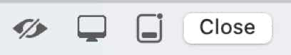
When you first add a popup, it will look like this on the canvas.
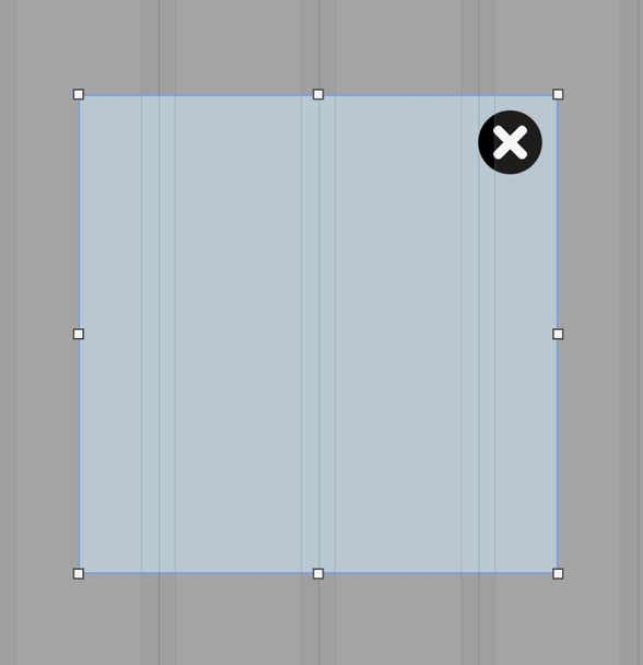
It’s a square box, centred on the canvas, with the background dimmed. It’s essentially a small, blank web page with a close button already added to the top-right corner. You can resize the box by dragging the resize handles, and it can be repositioned anywhere that’s convenient for you. The box itself will sit above any existing web page content you may have added - it’s a completely independent mini-web page and will not interfere with any existing page content.
You can style the box anyway you like from the style panel, including background color, border, rounding and all the other options you can apply to a normal box element. Here are the basic style elements of a popup.
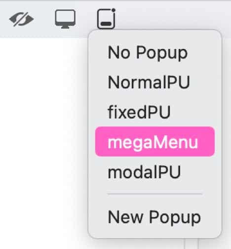
The first section allows you to decide what type of popup you want to create. The choices are:
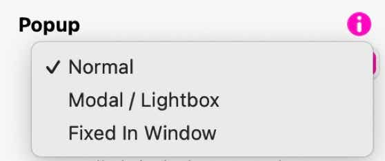
The Modal/Lightbox option is probably the most common type of popup. It typically creates a popup centred on the page with a dimmed background over the web page. Web page scrolling is disabled when this option is used. The Fixed in Window option gives you the ability to place the popup in a specific position within the browser window and doesn’t dim the background. This type of popup will stay fixed in position while the rest of the page scrolls behind it. The Normal option will create the popup and allow you to give it a specific page position where it will remain, even when scrolling, This option won’t dim the page background. We’ll take a look at these options a little later on.
The next option, Always on Top, is simply telling sparkle that the popup will always appear above any other element on the web page.
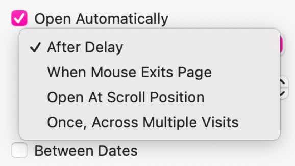
Open Automatically lets you create a popup up that will appear without any user intervention. This can happen after a specific period of time, when Mouse Exits Page, open when a certain scroll position is reached or you can have it popup just once, across multiple site visits.
To see the different types, click the buttons below.
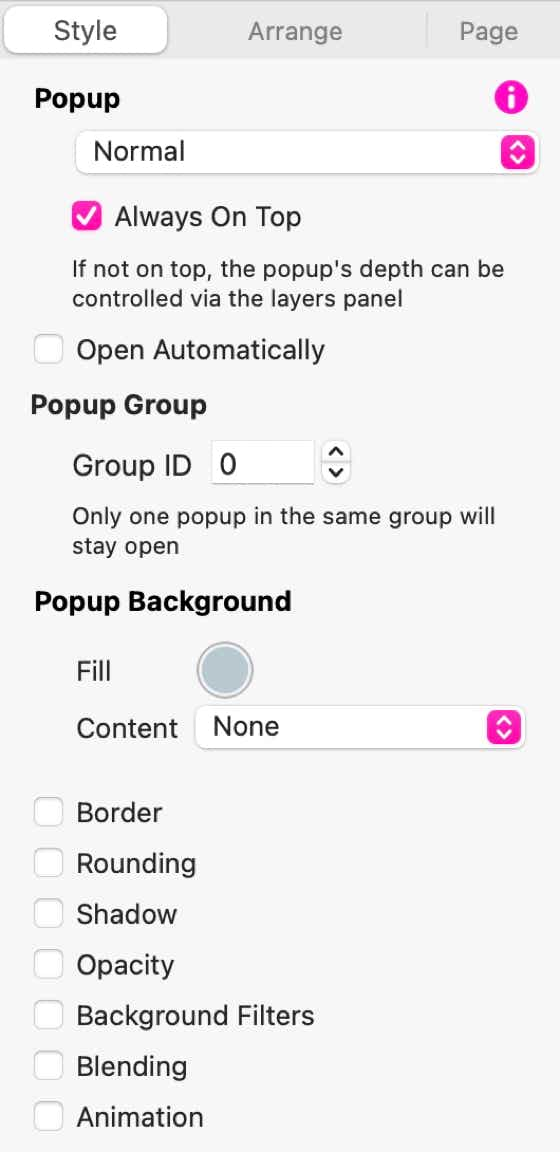
There is also an option to have the popup only appear between specific dates - great for time-promotions.
Each of the popup types have a specific practical use. Typically, the Modal / Lightbox type would be used where you want to display your popup in isolation - in other words, the page stops scrolling until the popup is closed. This is why this type of popup has a dimmed background - it signifies to users that the popup must be closed before they can continue browsing your website.
The Fixed in Window option would typically be used where you want to allow users to continue browsing your site whilst the popup is open. It remains fixed in the browser window until closed and all page content will scroll behind it.
The normal option allows you to get really creative, particularly if you want to add something like a mega-menu to your page. For example, clicking a main menu link could open a normal popup containing your other menu choices. This will remain open and fixed to your main navigation link until it is closed. Here is an example of that option in action. (Click the Mega Menu Link)
Creating the Popup Content
When your’e done editing the content, you can remove the popup from the canvas by clicking on the close button at the top-left of the canvas. This hides it from view so you can continue designing the rest of your webpage. If you wish to go back to editing your popup at any time, just select it from the popup icon at the top-left of the canvas.
Triggering the Popup
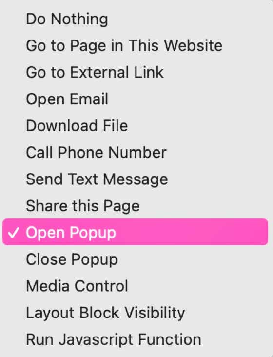
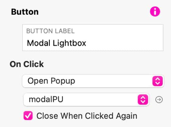
Already open popups will also need some sort of trigger to dismiss, or close them. Again, this can be done via a link that Closes the popup. In most cases, the same link can be used to open and close a popup. Just click the Close When Clicked Again checkbox on the opening link.
Modal / Lightbox popups can also be closed by clicking outside the modal (on the dimmed portion of the page). In most instances, the popup itself will contain a close button (included by default when you create a new popup). This can be replaced with a text link, as illustrated on the mega menu example above, or replaced with a normal button if preferred. Whatever link type you choose, the on-click action will always be Close Popup.
Nested Popups
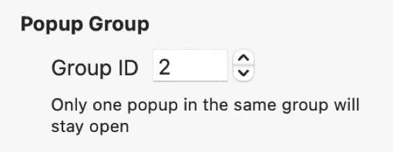
This example illustrates the default behaviour of light boxes in Sparkle. As one lightbox opens, any currently open one closes. This happens because lightboxes are treated as groups in which only one lightbox in the group can be opened at any one time. Groups are identified by a Group ID as shown here - you’ll find the option in the style panel.
If you wish to override this behaviour, you can assign a different ID to each lightbox. However, doing so may cause several light boxes to be opened simultaneously - leading to user confusion, and forcing users to close each lightbox manually. Of course, there may be instances where you want to keep one lightbox open - maybe one offering instructions. Click the link below to see this in action.
Popup Placement
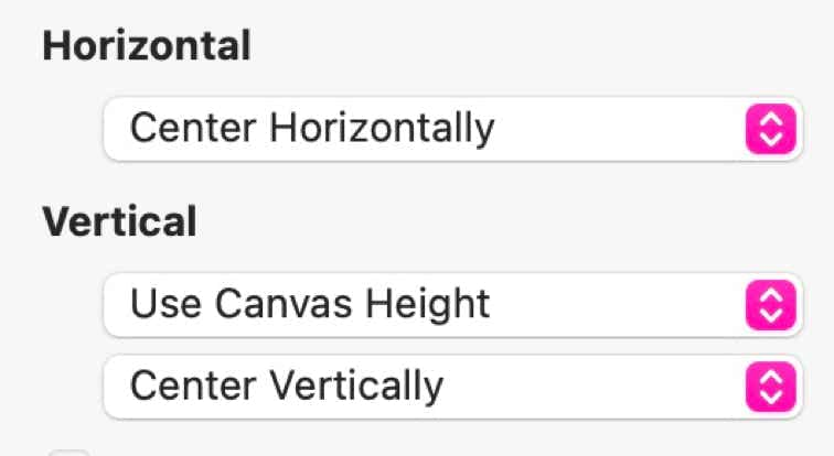
The Horizontal Placement options are:
The Vertical Placement options are:
Additionally, the vertical placement option let you specify whether to Center the popup Vertically, or to have it align to the Top or Bottom of the browser window - again giving you the option of setting a top or bottom margin.
NOTE: All of the above options apply to Modal/Lightbox and Fixed in Window type popups - they are both relative to the Browser Window size. The Normal popup type doesn’t use these options because normal popups are relative to the page - not the browser. Therefore, wherever they are placed on a page, that is where they will appear.
DID YOU NOTICE?
Please report any shortcoming in this documentation and we’ll fix it as soon as possible!
Updated for Sparkle 5.5
This is the popup where you create your mega menu. It remains fixed to the main menu bar until it is closed by the user. Meanwhile, the page can be scrolled as usual and the popup moves with the page
This is a secondary popup with a different Group ID. It will remain open until its manually closed, regardless of any other lightbox activity on the page.
To see that it is unaffected by other popups, click the Open Popup button again. You will still see the image light boxes, but this one will remain in place until it is closed.
This website makes use of cookies.
Please see our privacy policy for details.
It’s Okay
Deny