Sparkle’s layout grid is an excellent tool for creating engaging page or section layouts. Whilst it’s more commonly used for making image grids for galleries, it can also be used for other content such as text, buttons and boxes. In fact, Sparkle gives you a separate layout grid option specifically for image and video content - its called the Image/Video Grid. That element can automatically populate a grid with content through a special content selection panel. The standard grid, which we are discussing here, is a more flexible option for those who may want to add customised content to grid cells. Apart from these differences, both grid options are set up in much the same way.
You start by adding the element to your canvas. When it’s first added it will contain the default one row, three column structure - it looks like this:
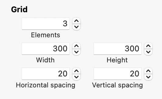
Once it’s on the canvas, you can start styling it and adding any content you want. Setting up your grid is done through the Style panel on the right of the screen. Here you can see the default settings. The grid has three elements (called cells). Each element is set at 300 x 300 pixels with horizontal and vertical spacing set at 20 px. By changing the grid number, you add more cells to the grid which appear under the first row of cells. So, by changing the number of elements from three to say six, you will have two rows of cells appear on your screen.
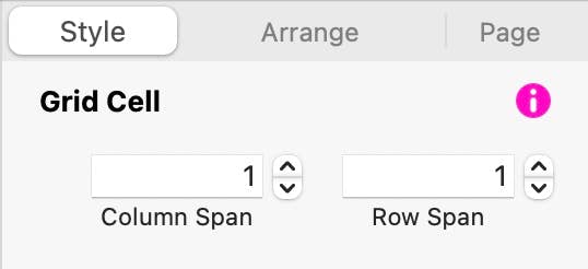
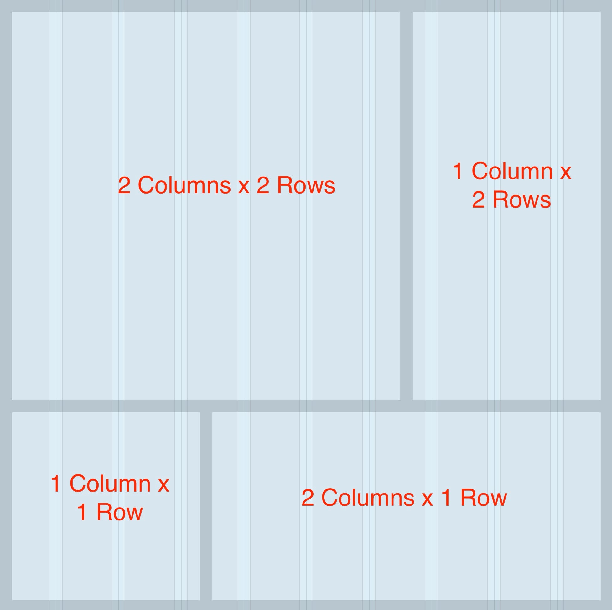
But, you can style your grid even further by selecting each grid cell and telling sparkle to change its size and shape. Again, in the style panel, you will see an option that tells Sparkle how many columns and/or rows that you want each cell to occupy in the grid. The option looks like this.
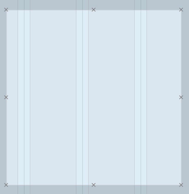
For example, if you set the first cell of your grid to span 2 columns and two rows. your grid will look like this.
If you don’t see the Grid Cell option in the style panel, it’s because you didn’t select a cell. Click in a cell to highlight it and the option will then appear. You know when the cell is selected on the canvas because it will have perimeter handles that look like small X’s.
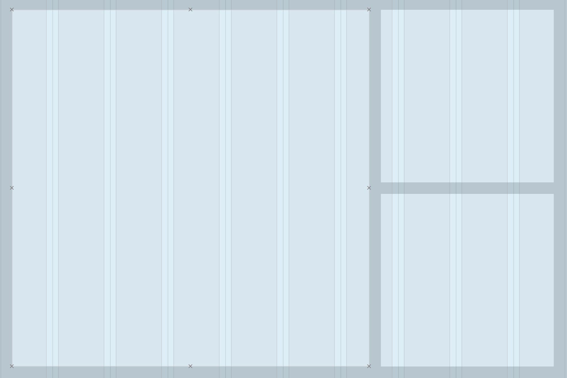
Continue working through each cell in turn to adjust their cell spans until your grid is how you want it to look. Here’s is an example of a simple grid that you may end up with. We’ve added the column and row spans so you can see how the grid was created.
Your grid can now be styled by using all the various options available to you in the style panel. Fill Colour, borders and rounding can be applied. One thing to note is that the Layout Grid itself, as well as the grid cells are filled with standard wire-frame colours when first added to the canvas. These colours can be changed to your liking in the Style Panel.
Next, it’s time to add content. Essentially, you can place almost any element inside a cell. Simply create and style the element on your canvas, and then drag it over one of the cells to place it. As you drag elements over the grid, the cells will highlight to signify that you’re in a drop zone for that cell. Just release your mouse button and the element will drop into the cells. This is how the highlight will look.
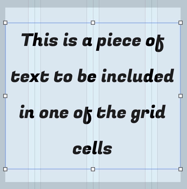
If your content is larger than the cell, when you drop the element it will be clipped so that it fits within the boundary of the cell. This may involve you in resizing the content to better suit the size and shape of the cell once the content is placed. You can do this by dragging on the elements resize handle or, in the case of text, change its font size in the style panel.
Of course, you’re not restricted to having a single element in a cell. If your cell is large enough, you can place an image, text and possibly a button all in the same cell it’s your call so get as creative as you wish.
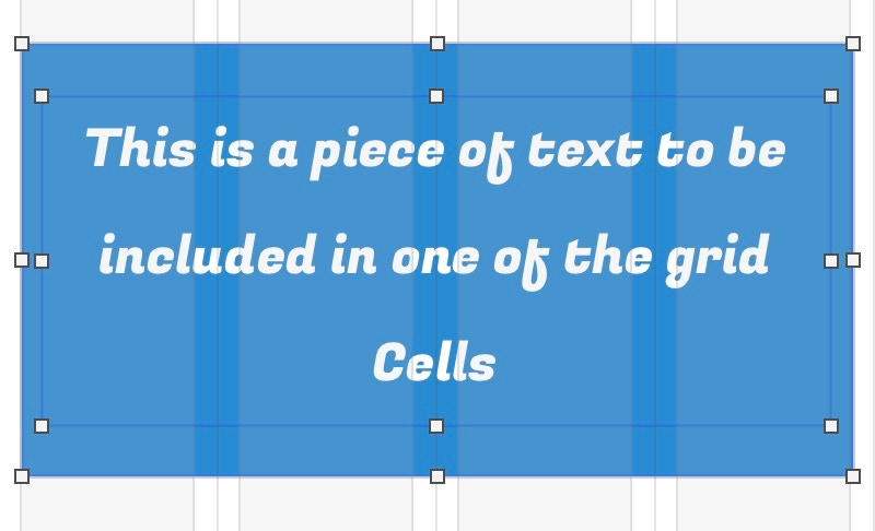
One thing to note about grid cells is that they are all styled the same way. For example, if you select a cell and change its background colour, all the cells in the grid will take on that same colour. This is to help ensure consistency and symmetry of your grid designs. However, you can give your cels different colour backgrounds by including a box as part of the content. By way of example, if I wanted the text box illustrated above to have a blue background, it would be created as part of the content, then grouped with the text before dropping it into a cell - like so.
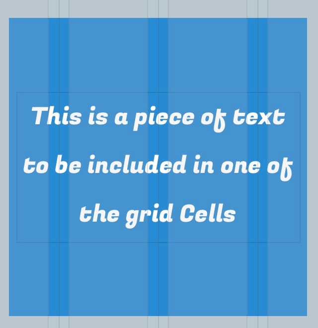
Once your content is inside the cell, you can adjust the size of the background and text independently so that it better fits the available space.
Getting Creative
You may be wondering how this feature of Sparkle can best be used in the modern world of visual communications - particularly in web design. To answer this question, all we really need to do is look at some of the more recent web page design trends - in particular, Bento Grid Designs. These are web pages that are inspired by the Japanese Bento lunch box. If you’re not familiar with these, they look like this:

The concept is fairly simple to grasp. Each element of the meal is contained within its own container. When it comes to web design, similar concepts come into play. Instead of food items, a Bento-designed web page has a series of cells, each containing a single idea or message. It’s a style that has been favoured by mainly tech companies, such as Apple. Essentially, the whole page can be quickly scanned by a user to get a feel of what a product or service is all about. Each idea is neatly compartmentalised. Hovering over, or clicking a compartment often provides more information about that particular aspect of the product or service. This ‘quick scan’ concept has become essential in today’s fast moving and, largely impatient, world of digital media. And so, the Bento Box design trend was born.
But, where to start when it comes to designing a web page for this type of design? Well, the first thing to remember is that you need lots of flexibility in your grid design in order to maximise the potential of the design concept. So, instead of looking at 3 column grids, as illustrated above, you would instead create a grid that gives you many more placement options. A good place to start is to try and match your layout grid to the underlying column grid of your Sparkle canvas.
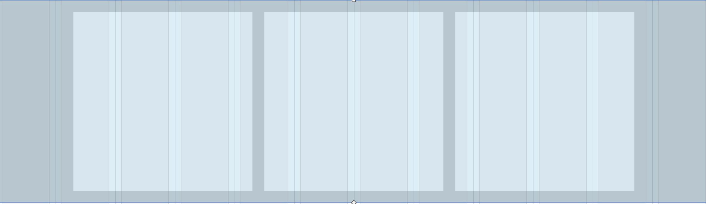
If we take Sparkle’s 12 column grid structure for a normal desktop page, we can set up a layout grid that follows the same format. The grid would be set up like this:

And it would look something like this on the canvas.

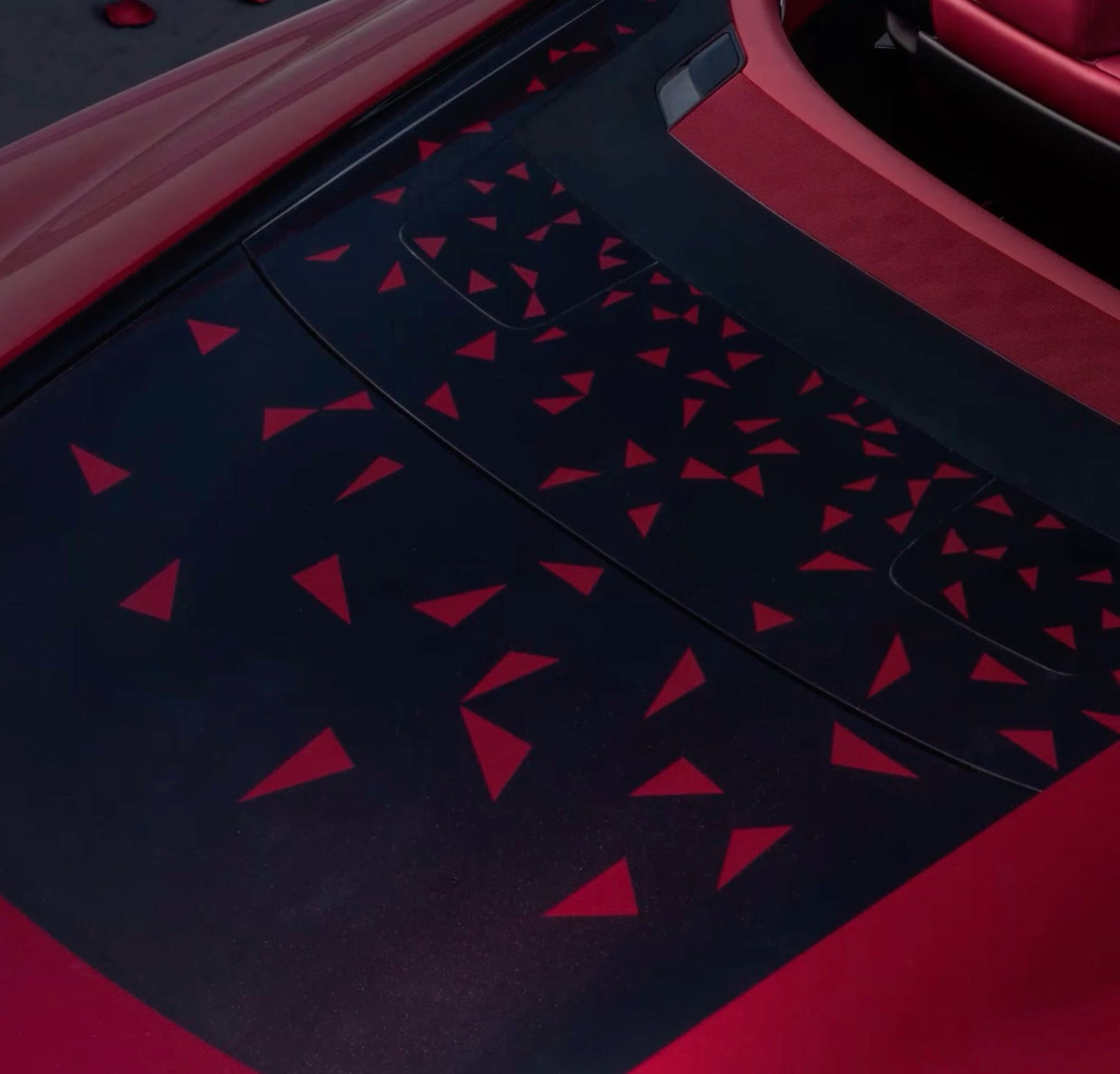
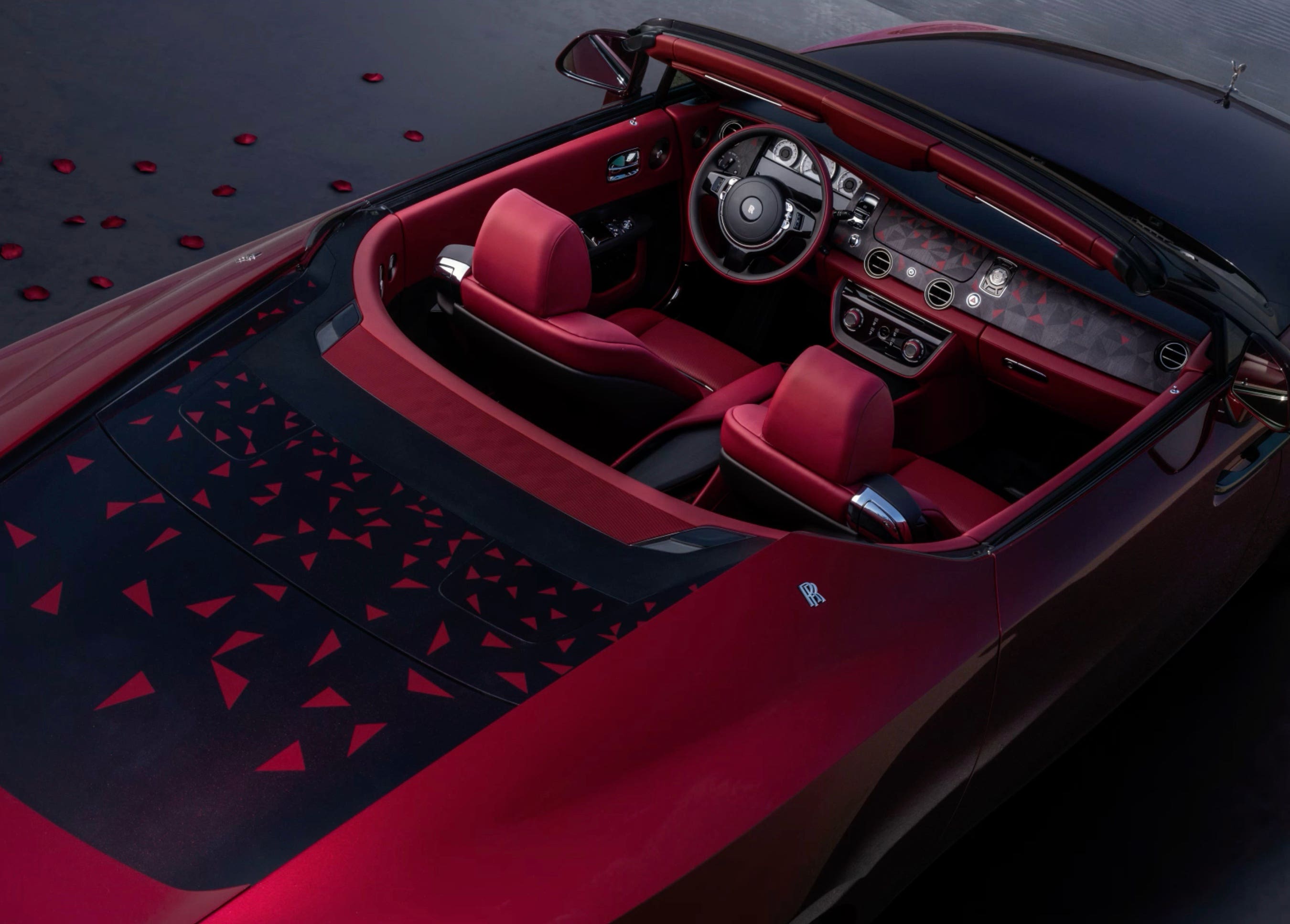
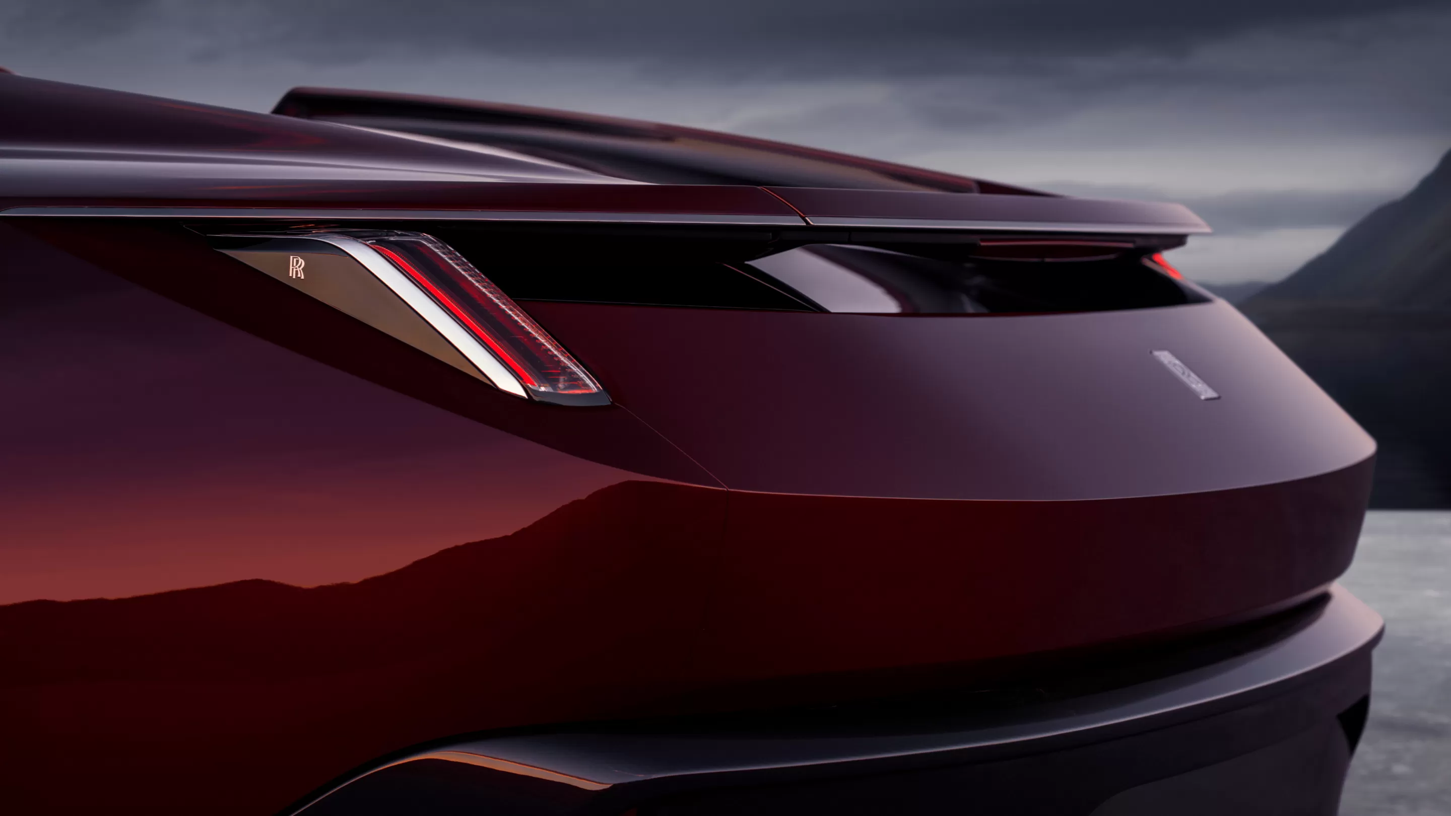
Clearly, a layout grid like this gives you a lot of row and column span choices for your individual cells. Below is a live example of how this concept can be used to effectively convey a visual message to those impatient web surfers who don’t like hunting for navigation, or other informative pages. Instead, they get a visual sense of the message of the page. By hovering or clicking/tapping on the various elements, they get to see more information, or larger pictures of the product. They could even be taken to other website pages for a more detailed explanation about a particular aspect of the page offering. Explore the grid below to get inspired.
Images Courtesy of Rolls Royce Motor Cars Ltd.
Although the layout grid isn’t specifically designed for video content, it is an option - By simply adding a video element to a cell, video content will display perfectly well, as can be seen in the above example. The only thing you should be wary of is to ensure your videos corresponds to the aspect ratio of the grid cell containing it. In the above example, the video is set to autoplay within its cell, but it can also be enlarged to full screen mode if required.
Please report any shortcoming in this documentation and we’ll fix it as soon as possible!
Updated for Sparkle 5.5

RELIVING A
FORGOTTEN ERA
Lorem ipsum dolor sit amet, consectetur adipiscing elit. Aliquam tincidunt lorem enim, eget fringilla turpis congue vitae. Phasellus aliquam nisi ut lorem vestibulum eleifend. Nulla ut arcu non nisi congue venenatis vitae ut ante. Nam iaculis sem nec ultrices dapibus. Phasellus eu ultrices turpis. Vivamus non mollis lacus, non ullamcorper nisl. Pellentesque habitant morbi tristique senectus et netus et malesuada fames ac turpis egestas. Phasellus sit amet scelerisque ipsum. Morbi nulla dolor, adipiscing non

ALL THE POWER YOU EXPECT
Lorem ipsum dolor sit amet, consectetur adipiscing elit. Aliquam tincidunt lorem enim, eget fringilla turpis congue vitae. Phasellus aliquam nisi ut lorem vestibulum eleifend. Nulla ut arcu non nisi congue venenatis vitae ut ante. Nam iaculis sem nec ultrices dapibus. Phasellus eu ultrices turpis. Vivamus non mollis lacus, non ullamcorper nisl. Pellentesque habitant morbi tristique senectus et netus et malesuada fames ac turpis egestas. Phasellus sit amet scelerisque ipsum. Morbi nulla dolor, adipiscing non
This website makes use of cookies.
Please see our privacy policy for details.
It’s Okay
Deny