Forms are one of the principal methods through which website visitors can contact you. They make life simpler for your visitors, whilst keeping your email addresses away from those troublesome harvesting bots. Creating forms in sparkle is really simple, and only involves adding form elements to your page. Here are the standard form elements available to you in Sparkle.
Text Input
Checkbox
Button
Slider
Radio Button
File Attachment
Option Selection
The most commonly used form element is the text input, or field element. This is a simple box that allows users to enter information, such as name, address, email or phone number etc. The box can be styled just like any other element in Sparkle through the style panel.
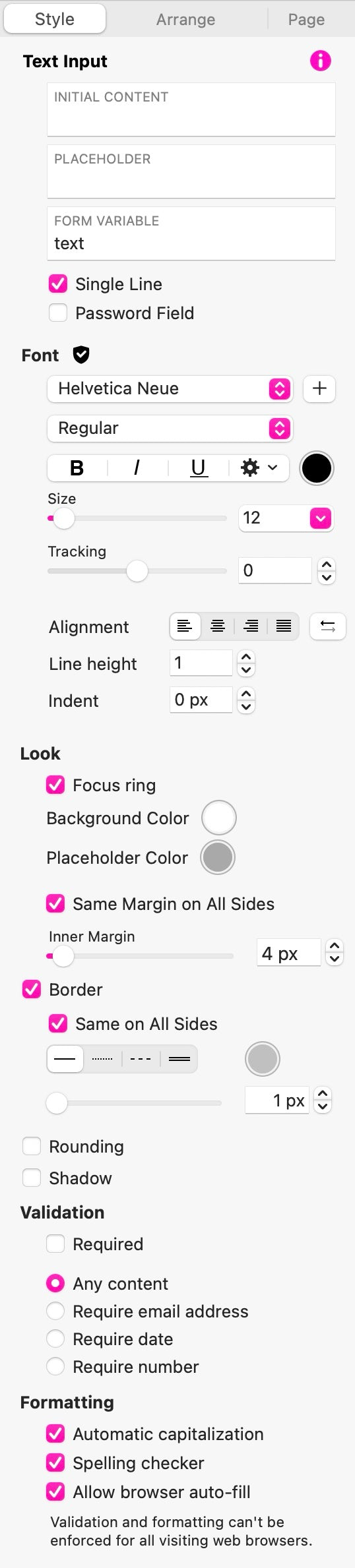
Text Input is where you set up the initial content that you want displayed in the field. Typically, this would be a default text that will be sent as part of the form if users do not override the content.
Placeholder is the content you may want displayed in the field to let users know what information is expected. Although this information is displayed, it can’t act as a default, and must be overridden by the user’s input.
Form Variable is simply a name that identifies this particular field. This is used when form results are sent to you. The email you receive will contain all the form variable names along with the user content entered into those fields. For example, a form variable of first_name would typically be used for the field where a user is expected to enter their first name. When the form results arrive in your mail box, it will contain a line such as first_name: Fred. If yon don’t add a form variable, Sparkle will allocate a generic variable for you.
Single Line: This checkbox forces the text entered to be single line only, such as an email address or phone number. Deselecting this option allows the text input to be multi-line, such as a message box.
Password Field: Checking this option will mask the input and replace it with a series of dots. Although the user will see dots in the field, the actual content will be sent as part of the form results. This option would be typically used for login forms, rather than forms designed to submit information via email.
The next options of the style panel are the familiar styling options of font, size, alignment etc.
Look gives you some additional styling options specific to form fields. When a form element is selected by a user, it becomes a focus point, commonly referred to as the focus ring. This lets the user know that they are about to enter information into a form field. With this option, you can set a background color and placeholder color for the field to make it more visible to users. Additionally, most browsers will highlight an active input field with a border.
Validation: This is where you can force only certain types of information to be entered into the field. You can also make the field a required field before the form can be sent.
Finally, we have the formatting section. Here you can force the capitalization of the field content, have the content spell-checked, or allow browsers to autofill content from the user’s computer.
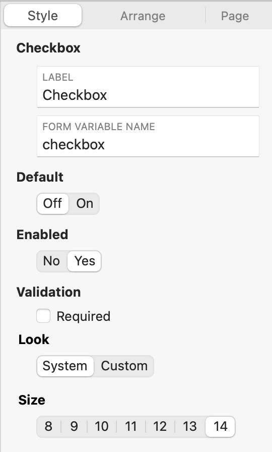
The Checkbox Field
This is used where you want to give users a choice of options that can be selected, such as ‘Check to receive our newsletter’, or ‘Send me special offers from time to time’. You can add as many checkbox field as needed, and users will be free to select all or some of the options. If you wish to restrict user choices to a single option only, use the Radio Button field instead.
The checkbox field presents a few additional options in the style panel. You can choose a default state of on or off. whether it’s enabled or not, and if it is a required field, such as an agreement to terms and conditions. The look of the checkbox can be customised by selecting the Custom option, or it can be styled automatically by the user’s browser. Finally, you can select the size of the checkbox.
The Radio Button
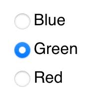
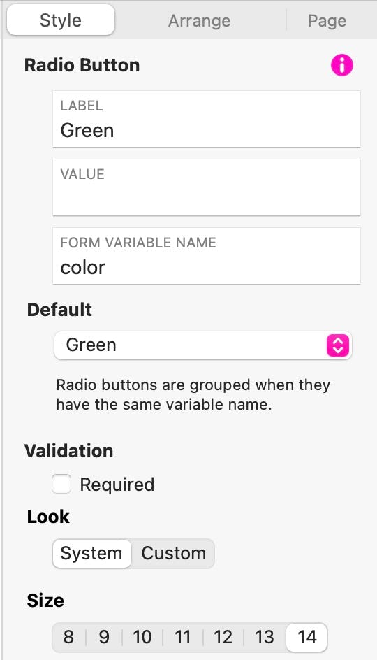
You would use this option where you want to restrict user choice to one option of a number presented. For example, you may use a radio button to allow users to select a color or size for a product being ordered. To do this you would add a number of radio buttons to your form - one for each choice. You would then give each button an identical variable name, such as ‘color’. This will group the radio buttons so that only one of the choices can be selected. The style panel will also give you the option of setting a default that will automatically be selected if users do not choose one of the options. Here is an example of a color choice selector with green set as the default.
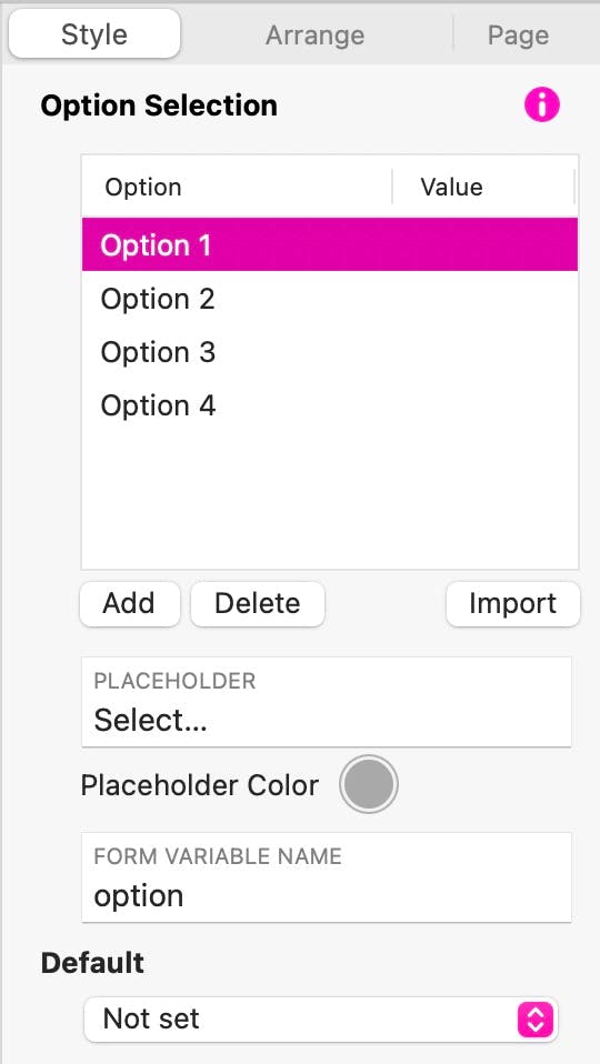
The Option Selection
This is another form of multiple-choice selector for users. In this case, the choices are presented as a drop-down list of option that users can select from. When the option selection element is added to the page, you will see some additional options in the style panel. The fist section allows you to create your list of options - just click the Add button to add more choices. You edit each option label by simply clicking its name in the list. You can, optionally, add a value for each option. This is a value that will be sent as part of the form submission. If you don’t add a value, only the option label is sent as part of the form result.
There is also a button that allows you to import a list of options. This is typically used where you may want something like a Country selector as part of an address submission on a form. Clearly, with over 180 countries in the world, creating the list from scratch would be time consuming. However, you can download a list of countries in plain text format from many websites. Those lists can be imported directly into sparkle by using the Import feature, Here is an example of a country drop down.
If you would like to try this for yourself, here is a download link for a countries text file.
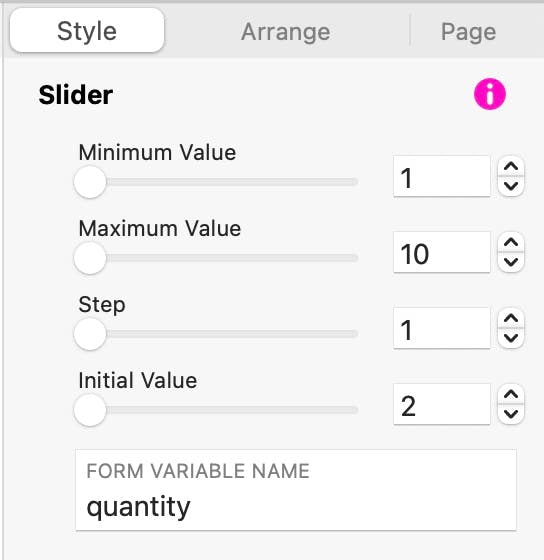
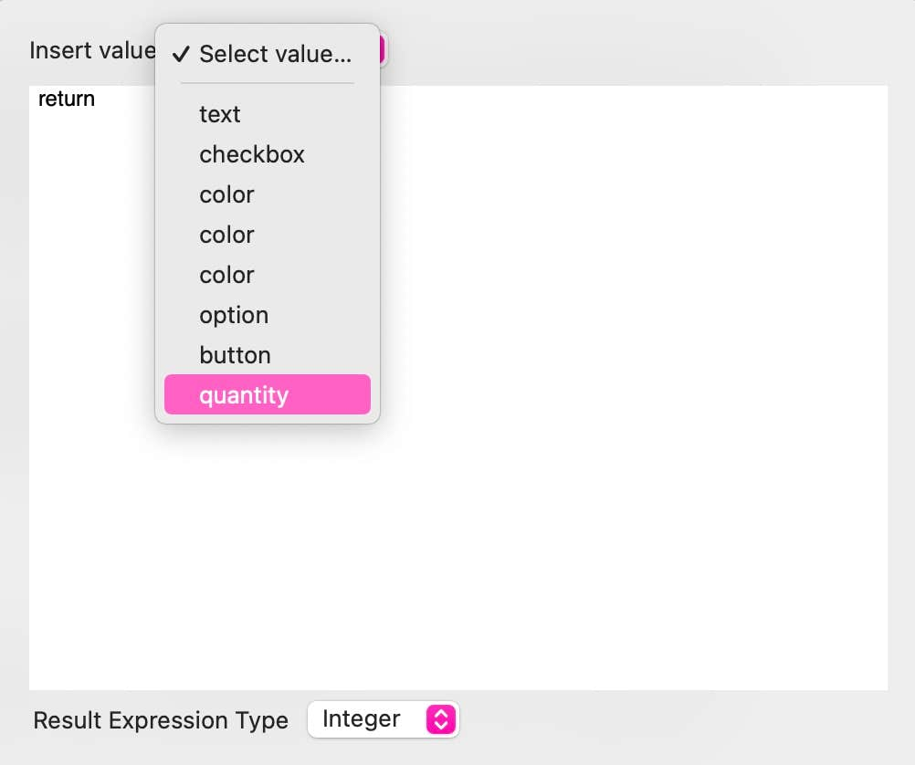
The values are set up in the style panel by setting the minimum value, the maximum value, the step and the initial value of the slider. We also give the slider a form variable name - in this example we use the variable quantity. When the form is submitted, the email will show the variable name, followed by the value selected by the user. It will look something like quantity: 2.
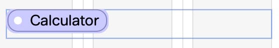
In order to display to users what quantity has been selected, we would also add a text box to the right of the slider to show the quantity selected. This is achieved by using a Smart Field in the text box - you’ll see the option in the style panel when your text box is selected on the canvas - it looks like this.
The Slider element
This is a simple slider that allows users to select a value by dragging a slider. It has many uses, but by way of example, we may want to use the slider as a way of ordering a specific quantity of a product. In our example below, the slider can be used to select a quantity of between 1 and 10 with a default quantity of 2.
When you insert a smart field, you will be presented with a panel of options. In this instance, the option we want is Calculator. This will place a calculator smart field into the text box - it looks like this.

Click on the calculator smart field to set its value. To help you, Sparkle looks at your page and finds all the available variables that you can use in your calculated field. In this case, Sparkle found our variable quantity attached to the slider. This is the value we need to display next to the slider, so that’s the option chosen. Now, as the slider is moved, the appropriate vale is displayed to the user.
Note: We have a whole section in the user documentation for smart fields and their usage. We’ve only deviated to the topic here to show the relevance of smart elements in the context of this particular form element.
Select…
The element itself is a group of two elements, the file field and the button. These can be selected and styled individually. When the group is selected, you have full control over what users can upload with the form results. You can specify the type of files allowed, as well as the file size limit.
The File Attachment element
This is a simple file upload element where users can browse for a file on their computer and attach it to the form.

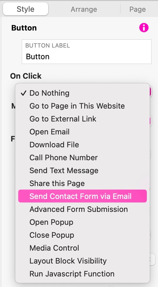
The Button element
This is the element that controls your form submission. Although we have a whole section in the documentation about links and on-click actions, we’ll quickly address the options available specifically for submitting form details.
The most commonly used method of submitting a form is the Send Contact Form via Email option. This option gathers up all the form data from your page and submits it to your server for onward delivery to a designated email address. All the action is controlled via the style panel when you select this method of submission.
Form Submission Options
The first thing is to give your button a label. This will usually be the word Submit, but it can be anything that’s appropriate for your form.
The on-click action will be Send Contact Form via Email. The email heading can be anything that helps you identify the email when it arrives in your mailbox. The From Email Address should be an email address on your server. In our example, it’s a noreply email address, but it can be an actual email address you use every day if you prefer. It’s quite important to add a domain specific email address because some web hosting companies may not process mail that appears to originate from another server - such as gmail.
The To Email Address is the address at which you want to receive your responses. Again, this should ideally be an email address associated with your domain so as to avoid any delivery issues caused by spam filters or web host policies. The Subject will be the information you wish to appear in the subject line of responses you receive.
Next, you have two options. The first, Email via web server, the other is Use Custom SMTP Server. In most case the first option will work just fine. This leaves your web host’s sendmail function to process the email and forward it on to you. However, there are a growing number of web hosts that prefer that you have your forms processed through a correctly configured email account that you own and control. Essentially, this is like sending an email via your normal email account. If your hosting company insists on you using this option, you can add the email account login details into to the style panel after selecting the SMTP option.
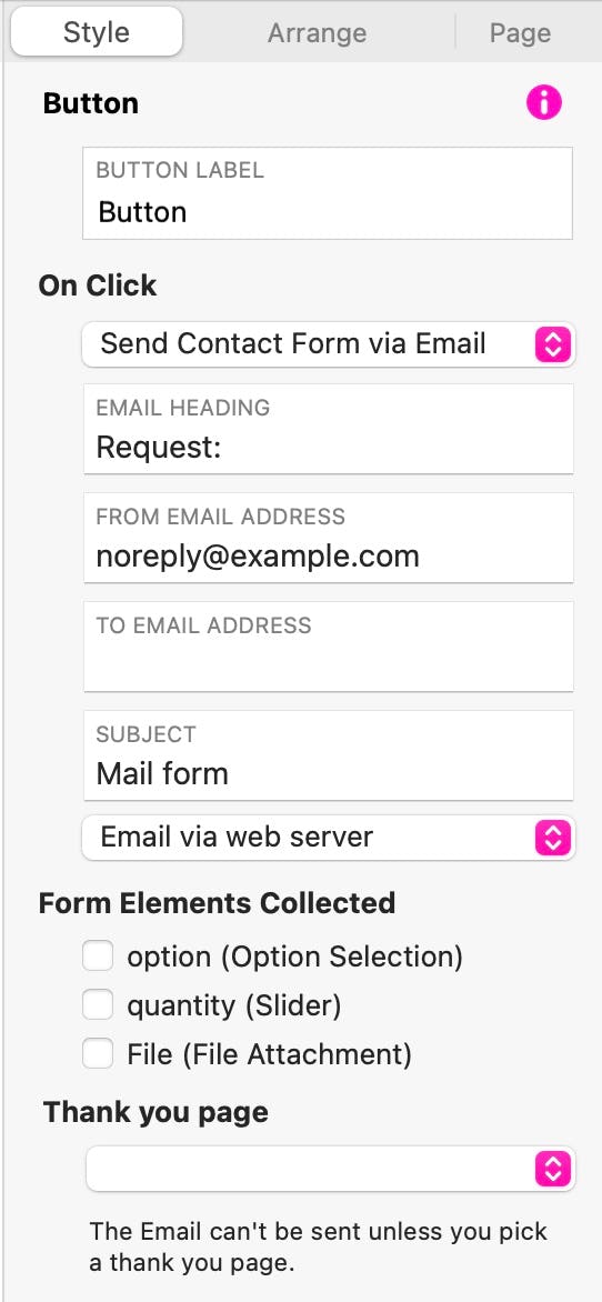
Form Elements Collected
This section of the style panel will list all the form elements Sparkle finds on your page, and gives you the option of submitting them as part of this submit button, or, maybe leaving some of them to be submitted by another button. Whatever your choice, you will simply check the boxes against all the form elements you want submitted. This is a really useful feature of Sparkle as it allows great flexibility in how you construct pages for information gathering.
In most web development applications, forms are constructed as separate elements in which all the form fields must be contained. This gives rise to the normal style of most web forms as a box containing fields and a submit button. Whilst this is how most people design forms, there are use-case scenarios where this may not be the ideal solution. For example, an educator may be setting online exams or coursework for students. In this situation, the educator may want to present the course material in a way similar to printed coursework. It may start with a subject overview, a few worked examples, followed by a few exercises for the student to complete. In this scenario, the student would work through the online page, answering questions and completing the exercises as they progress. When they reach the end of the page, they can add their name and other details and submit their work with a simple button.
Because Sparkle scours the entire page looking for all the form elements that students may complete on their journey, they can all be gathered up and sent as a results email to the educator. This familiar approach to training material is often difficult to achieve in other web builders without having specially coded pages, but in Sparkle, it’s a breeze.
Thank you page
This is the final piece of information that Sparkle will need to successfully submit your form. Your form cannot be sent unless you have a thank you page. This will be the page that users will be directed to after they’ve submitted a form. It not only reassures users that their information has been sent, it also gives you the opportunity of providing additional links to other pages of relevance in your website after submission.
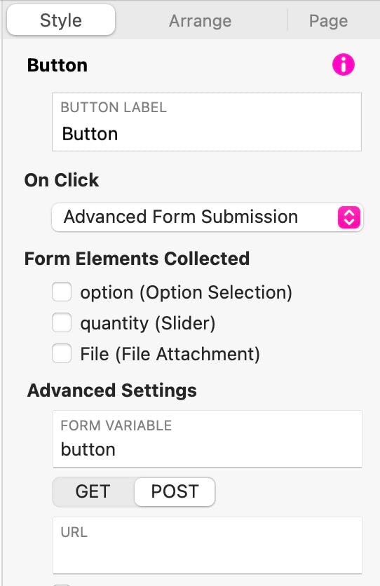
Advanced Form Submission
There are some situations where you may wish to use a third party form processor, or maybe use a customised form script on your own server. For these situations, you can use the Advanced Form Submission option. This allows you to enter the URL of the form processing service or script and set a method of submission (Get or Post) These options will be given to you by the service provider or script developer. Simply enter the information in this section and choose the form elements you want to submit.
Please report any shortcoming in this documentation and we’ll fix it as soon as possible!
Updated for Sparkle 5.5
This website makes use of cookies.
Please see our privacy policy for details.
It’s Okay
Deny